Search results for

"page builder"

Leadpages vs Instapage: the Landing Page Builder Matchup

Every marketer spending money on online ads knows that, apart from the ad itself, another crucial element of a marketing campaign is where the visitor ends up when clicking on the ad – the landing page. Landing pages serve as the final steps in the funnel, converting the users obtained by the ad clicks into customers by motivating them to take specific actions. Those could be anything from signing up for a newsletter or a free trial, to leaving their contact information or even purchasing a product. While it’s definitely necessary to maximize your ad click-through and efficiency, landing pages are where all the magic happens – their importance in driving your website’s growth and profitability is difficult to overestimate.

Since landing pages are essential to any website looking to grow, powerful specialized toolkits exist nowadays to create, optimize and analyze them professionally. Two stand out: Leadpages and Instapage, being close competitors and market leaders. In order to make a choice in one’s favour, let’s look at the features and costs as our primary decision factors.

Feature Comparison

Being close competitors, Instapage and Leadpages share a large proportion of features which can be considered close substitutes, such as drag-and-drop landing page builders, analytics, and dozens of third-party service integrations, thus we will only mention those which stand out for one or the other.

The essential element of each platform is a drag-and-drop landing page constructor, and both Instapage and Leadpages offer flexible and powerful solutions. There are template libraries available with hundreds of pre-optimized blueprints which can be edited to fit your specific needs, the only significant difference is in the fact that Instapage allows creating a new landing page template from a blank canvas, whereas Leadpages only allows taking an existing library template as the starting point. For those with a clear own design idea in mind a blank starting page might be an easier option than editing a predefined template. Moreover, Instapage allows editing the underlying code of the landing page in addition to the visual interface, which is a nifty feature for the users who are familiar with coding and want to tinker with the fine details of their landing pages.

A feature worth mentioning separately is A/B split testing, which is the process of creating two or more versions of the same landing page and displaying them randomly to your incoming traffic in order to find out which of the versions is more effective at driving conversions. Split testing for landing pages is available on both platforms, yet only starting from the second pricing plan on each (Leadpages Pro and Instapage Professional). Without split testing, the entire concept of landing pages kind of loses half of its value, since the primary idea is to maximize conversions. This is something to consider when choosing between the pricing plans (more on that – in the next section).

Another important distinguishing factor is the ease of collaboration: whether you’re a freelance professional or an agency working with clients – or conducting marketing activities for your in-house needs – it’s rare to work in complete isolation. Each marketing project has various team members and stakeholders, and they should be able to participate in each step of the process seamlessly. In this respect Instapage clearly takes the gold, offering a one of a kind collaboration system with instant feedback and real-time from any member, as well as secure sharing with anyone, from your fellow team members to your client’s legal/compliance depts. This set of features allows successfully eliminating many bottlenecks faced by marketing teams and make the process of landing page roll-out much more efficient. While also focussing on real-time editing, Leadpages doesn’t quite match the power of Instapage’s collaboration interface at the moment.

Price Comparison

Each of the platforms offers three pricing plans, the simplest targeted to individuals and freelancers, the medium being the most value-for-money option for most teams since it includes A/B testing, and the advanced plan focussed on bringing maximum features for large enterprises and agencies.

The starter plans are priced very similarly, with Leadpages Standard at $25 and Instapage Basic at $29 with annual billing. The mid-range solutions with A/B testing included cost $48 per month for Leadpages Pro and $55 for Instapage Professional. Since Leadpages offers significant discounts from its monthly-based billing levels, in case of both packages they have a slight upper hand when it comes to pricing. The most powerful kits pack even more extra features and will set you back $127 per month for Instapage Premium and a hefty $199 for Leadpages Advanced, giving the former a clear lead in this segment.

It is worth noting that Instapage offers a 2-week trial period with full functionality, without having to input your credit card details, while Leadpages does not let you try out the product without making a purchase. You can give Leadpages a test drive by buying one month of Standard subscription for $37 (note the difference vs the annual billing cycle mentioned above) and cancelling any time during that period: the company offers a 30-day money back guarantee.

Conclusion: Which One is Better?

Choosing between Instapage and Leadpages is not an easy task: both offer highly capable and closely similar platforms for building and managing landing pages. After a more detailed consideration, one can see that Instapage is slightly ahead in terms of features, especially collaboration possibilities, while Leadpages is priced slightly lower for both the basic and mid-range plan. Adding the fact that you need to pay up-front to even test Leadpages, though, our preferences go to Instapage in this comparison.

Have questions about Instapage vs Leadpages? Using one or the other (or both) and would like to add your opinion? We’ll be glad to hear it out in the comments section below, let’s discuss!

Paperform Review: Should You Choose This Form Builder in 2025?

Pretty much anytime you need to collect information from your visitors, you’ll need an online form – whether you need to convert leads into customers, or gather RSVPs for an event.

There’s one tool that goes a step further.

Paperform transcends the traditional form builder by letting you create more than a form, more than a landing page – we call it a „landing form“. Think sleek-looking, customizable user data input pages that can analyze form data to increase conversions!

In this detailed review, we will cover the ins and outs of Paperform and discuss the following questions:

  • 🦄What is unique about Paperform?
  • 📊How does it perform compared to alternatives?
  • 💰Which pricing options are available?
  • 👤Who should use Paperform and why?

Before we delve into the details of Paperform, let’s get a quick overview of the product:

What Is Paperform?

Paperform is all about allowing anyone to easily create online forms without any technical knowledge. Thanks to Paperform’s intuitive and visual editor, it makes creating forms as easy as writing an online doc.

Try Paperform for free ›

No matter the need, Paperform’s 300+ templates are versatile and dynamic enough to be used when you find yourself needing an all inclusive tool for the following situations:

  • Feedback and evaluation forms – gather feedback and aggregate the results with a range of integrations. Choose over 20 question types to maximise responses and use the Theme menu to change images, colours, and other UI elements to brand your form.
  • Bookings and appointment forms – use the special appointments question type to accept bookings and appointments and connect your calendar so there are no scheduling conflicts. Defaults like timezone are set for you, or you can use the Configure menu to customize the length of a booking, or, have it calculated automatically based upon respondents‘ answers.
  • Lead generation forms – convert website visitors by keeping your leads focused and engaged from start to submission through creating a painless, aesthetic form. You can analyse views, completion rates and find out where your customer dropped off so you can learn from customer behaviour to improve your form and increase your conversions.
  • Safely accept payments – both one-off and recurring subscriptions in multiple currencies through over 1000+ integrations (!) including Stripe, PayPal and Square.
  • Collect data – seamlessly gather all types of data like images, text, files, phone numbers, and signatures. Then, export the data in PDF, CSV, or Word formats to easily manage — forget about the hassles of an excel sheet or legacy database.
  • Generate invoices and quotes – your forms are able to produce automatic purchase documents based on customers’ actions – which means you can email receipts and custom PDFs to your customers without lifting a finger.

How does Paperform deliver on these use cases? Let’s see if there’s anything that makes Paperform stand out from other form builders:

Paperform Features

Paperform makes it easy to create and personalize your online forms and and landing pages. Like most other similar tools, the Paperform builder doesn’t require you to know even the slightest bit of coding to use any of its features.

Conditional logic: forget about rigid forms that have customers exiting out of frustration before they can even submit it. No customer appreciates that, and you’ll definitely score some brownie points by making form-filling a breeze. Paperform’s conditional logic helps you do just that.

This form feature enables your forms to be dynamic and interactive, showing and hiding fields according to respondents‘ answers. This means you can create a personalized conversation for a more engaging experience (and hence more form completions).

Paperform: conditional logic

If you want to customize your forms further to really wow your customer, you can opt to have your form pre-fill answers, automatically inserting information from the previous answers.

Third-party integrations: Paperform supports over 1000 of them, allowing you to automate workflows and reduce costs and bottlenecks.

The beauty of this feature is that you can integrate your apps directly so that you can improve the functionality of your forms and increase your productivity. Paperform integrations allow you to collect signatures, store and analyze volumes of data and generally simplify your workflows.

Advanced form analytics allows you to take one look and really gauge the behavior of not just your customers, but all the prospects who have viewed your forms.

You don’t have to churn your own butter, so why manually analyze data sets? Leave this to Paperform Analytics. The dashboard lets you view critical information like completion rates, drop-off questions and forms views at a click of a button.

Paperform analytics

Being able to view form submissions, sales figures and incomplete submissions allows you to better understand your customers and see exactly what question they were up to when they exited the form, meaning you can improve your design, questions or functionality exactly where it’s needed to improve response rates and increase conversions.

Export all this data to the destination of your choice. You can then manage it from Google Sheet, your favourite CRM software, or any one of the 25 analytics apps you can integrate on Paperform.

Calculations can be incorporated into your website, landing pages and forms in a matter of minutes to combine, transform and manipulate answers live on your forms. From simple sub-scores to complex displays of logic, „Calculations“ is a special form field in Paperform that you can wield to do a range of things.

Complex price calculations are made easy, automatically calculating and updating costs and quotes in real time based on varying factors.

A form, for example, can use a calculation field to determine the price of a rental period. After choosing room size and length of stay, the calculation updates live on the form.

Document-style builder allows you to create a form with Papeform in much the same way as you would create a Microsoft Word document. Simply type free-text directly where you want it on the page. You can easily and intuitively add questions with logic and add payment/donation fields, or even use HTML/CSS if you’d like:

Paperform doc-style editor

Unlike most other form toolkits, Paperform makes the process of creating a form almost like writing a story. All you have to do is type anywhere onto the page and insert fields – quick and easy, once you get used to the idea.

Speaking of the form builder:

Form Builder, Templates, and Design

To start using the Paperform builder, you can sign up for a free 14 day trial. Simply enter a few details, and you can get creating interactive forms:

Sign up for a 14-day Paperform trial ›

The Paperform dashboard is where users can select create form and choose to either start from a blank canvas or one of the hundreds ready-made templates.

Paperform: start

The available design options range from a restaurant order form template to “What Kind Of Dragon Are You” quiz template… in other words – there will be a format for whatever you need.

After you’ve selected a template, you can customize it as little or as much as you like. Just as you would with a Word document, simply highlight the text you’ve entered to style your text in different headings and fonts.

Once you’ve selected a line of writing, you can insert different kinds of content using the panel that appears alongside it on the left:

Paperform: editor

While most other form builders feature a drag and drop interface, Paperform’s free form editor lets you type your questions wherever you want, just as you would on a Word document. You can click anywhere, type anywhere and easily add pictures, videos, products and more.

You can choose to insert images, embed videos and use breaks to divide the form into different sections of content.

Paperform have made adding questions super simple: select the line and choose the ‘add questions’ option.

From there, you can use any one of the 23 question types including multiple choice, email, and drop-downs. If you then head to the dashboard, you can configure the questions as well as duplicate, move, and delete them.

***

You can also personalize your landing pages or forms in terms of visual style, using an interface that looks eerily familiar to anyone who’s ever used WordPress or a similar CMS:

Paperform styling

The ‘Theme’ menu is where you can pick the overall theme of your form or page, play with colours, and change the fonts, logos and buttons.

Paperform also has a feature allowing you to import themes which is a huge score if you want to create multiple forms with identical design and saves you from needlessly re-creating your favorite form.

Sounds great for far! Where can all this form goodness be used? The answer is: almost everywhere 🚀

Paperform Use Cases

Regardless of your field of activity, if you need to collect information from site visitors, Paperform has got your back:

Running a small business is hard work and you often have a finger in every pie. Paperform has made it super simple for anyone to kickstart their business online by creating forms and landing pages in a matter of minutes without having any technical skills.

Collecting information from your customers is a breeze through the generous selection of question types such as e-signature, eCommerce products and email. The forms are easily customizable to match your branding.

Convert more real estate leads by creating aesthetic, user-friendly forms that also have the ability to automatically send invoices and follow up emails, automating your workflow so you can spend more time doing the important things — selling houses.

Accepting payments and subscriptions is just as easy — Paperform integrates with popular payment services like Stripe, PayPal, and Square. After a purchase is made, a custom PDF receipt can then be automatically sent to your customer. Customers can select multiple products, and pricing can be calculated automatically based on certain criteria, helping to manage your inventory — so you don’t have to.

Organising events requires a lot of multitasking. With end-to-end automation available to manage registrations, vendors, ticketing and reporting, event management is made simple. Conditional logic allows a smooth registration process so you can collect important information all in the one place.

Don’t forget to check in on the success of your forms using the analytics dashboard 📈 Measure views, completion rates and see where your respondent dropped off answering their question.

Oh, and don’t worry, your forms look great on any device (well, maybe apart from a smart watch)

Marketing automation, i.e. any activity that deals with collecting leads and converting them into sales on a massive scale is another important field of application for Paperform.

Simple fact: easy to use, appealing forms and landing pages convert better. With Paperform, you can leverage the analytics dashboard to monitor performance and gain deeper insights into your customers‘ behaviour. Create a seamless customer experience, tailored to the individual user to boost your conversion rate through using conditional logic.

Built-in email automation means you can easily set up automatic responses to be sent to everyone who interacts with your forms and landing pages. With over 25 messaging and email app integrations available, you can schedule your emails and SMS’ in advance — you’ll never have to manually send an email again.

As a cherry on top, a huge time-saving benefit is the ability to easily transfer form data and leads to any one of the 130+ CRM tools, including Hubspot and Marketo – no repeated manual work required.

Pricing: Should You Get Paperform?

As we mentioned earlier, Paperform is free for the first two weeks; after that, you can choose between one of the three available subscription plans:

The Essentials plan starts at $15 per month ($12.5 with early billing) and is ideal for businesses which want to create simple forms and don’t expect too many users or submissions.

If you use online forms on a regular basis and want the maximum benefit of all available features, the Pro and Agency plans allow you to take your form making to the next level with the ability to add fields such as calculations and scoring.

Paperform pricing

If you belong to a registered NPO or charity, you can apply to receive special discounted Paperform subscription prices. “Pay what you want” is offered on the Pro tier and the Agency tier is discounted at 50%.

Regardless of your needs, it is recommended to give Paperform a spin before committing to a subscription; the 14-day trial is definitely a good idea:

Try Paperform for free ›

In any case, now you have more information to decide whether Paperform is right for you. If you’re after a hassle-free, user-friendly form builder with serious extension and intergration options, this might be the one.

Full JotForm Review (2025): Should You Use This Online Form Builder?

☑︎ This review was last updated in Juli 2025

Ah, online forms! One of those things you don’t know you need – until you need it really badly.

JotForm is one of the most popular solutions for this situation… but since you’re reading this, you are probably also wondering:

„Building and managing online forms sounds like a hassle! A great tool should be simple to use but also meet my specific needs and requirements. Should I trust JotForm to do the job?“

Let’s find out together. In this detailed review, we will analyze JotForm from every possible angle and cover the most popular questions –

  • 👶Is JotForm easy to use for beginners?
  • 🔒Security and privacy – should you trust JotForm?
  • 💸Which pricing plan should you choose?
  • 🏆Is JotForm better than the alternatives?

Before we discuss the unique features that distinguish JotFrom from alternative services, let’s get a quick overview of the service itself:

What Is JotForm?

Forms are everywhere! Every time an organization needs some kind of input from a large number of people – be it customers, employees, supporters, students, etc. – it uses some sort of form to collect this information.

The main idea behind JotForm is to make the entire process as easy as possible: from actually building the forms, to managing the gathered data.

…And it’s not just about surveys – the range of possible uses for JotForm also includes the following popular scenarios:

  • Applying or registering for events, jobs, scholarships, memberships – even loans or housing. Simplicity 🎯 is key here, since there’s typically a lot of information to be collected from a single person in such cases.
  • Giving feedback or evaluation, which also includes filing complaints, leaving reviews or ratings, or voting on a decision. Clarity 🔮 is critically important here, as well as the ability to analyze the data to form insights.
  • Getting in touch with an organization (or public figure) in order to ask a question, offer cooperation or simply share an idea. Since this type of form is often used by strangers first-time visitors, privacy 👁️‍🗨️ and data protection become additional concerns.
  • Making a reservation, which can mean anything from booking a table or scheduling an appointment, to hiring various services, to vacation rentals. Getting started with this type of form is much easier via ready-made templates 📑 that include all the necessary fields and interactions.
  • Obtaining new business prospects, both online and offline; the latter also implies the ability to use the forms on a variety of devices 📱 such as smartphones and tablets.
  • Ordering a product or service online is one of the use cases you wouldn’t typically expect from an online form builder, but JotForm possesses sufficient security 🔑 and payment integrations to build surprisingly efficient checkout forms.

…and we haven’t even mentioned niche cases and special requirements, such as collecting sensitive health data from patients! (e.g. under HIPAA in the United States)

JotForm promises to solve each of those challenges – but does it actually deliver? Let’s see what’s so special about this tool.

Unique Features of JotForm

Of course, JotForm is not the only way to build online forms – so are there any specific advantages to using it?

Actually, there are quite a few:

  • Conditional logic makes it possible to “teach” your form to react to the user’s inputs, automatically adding, removing, hiding, skipping or changing fields in response to specific answers.

You can also use any field the respondent completes as an input for the rest of the form – e.g. to alter the labels or recalculate values of other fields!

This opens up almost limitless possibilities for making your forms even more effective, e.g. easily building highly personalized thank-you pages:

JotForm: conditional logic

And yes, conditional rules are present (to some extent) in most form builders, even Google Forms – but none comes even close to JotForm in terms of flexibility.

  • Apps and integrations library is what really makes JotForm exponentially more powerful, by connecting your forms with hundreds of third-party services.

This allows you to add various cool things to your forms (like signatures or additional verification), export form data into your favorite project management or analytics tools, and even securely collect payments without the need for expensive e-commerce solutions!

Speaking of security:

  • Data protection and privacy features ensure safety both for the creators and the respondents: JotForm uses 256-bit SSL certificates on all forms and lets you decide exactly who can fill in the form and who can see the results.

You can also choose to additionally encrypt all form responses with an RSA-2048 key before they are submitted to you, which acts as a double insurance against anyone trying to intercept your users’ data.

In order to enable encryption, you will need to go to your form’s settings and click on the brown “Show more options” button.

In addition to these security features, we should mention several abbreviations that might sound familiar to you. Here goes:

JotForm is fully compliant with GDPR (European data protection laws) and PCI (for payment processing) – and if you need to collect health-related information from your respondents, you can upgrade for HIPAA compliance.

  • Advanced publishing options give you full freedom when it comes to delivering your forms to your audience. Again, JotForm really raises the bar here, compared to other similar tools:

There are numerous ways you can publish a form created in JotForm – as a direct link, a social media post, or even a fillable PDF document –

JotForm publishing

You can also email the form directly to your respondents or embed it into your website – the specific code for each popular web platform like WordPress or Shopify is generated for you automatically.

  • PDF constructor is another unique feature of JotForm that lets you easily convert form responses into professional-looking PDF documents – ideal for generating invoices, proposals, tickets, certificates, etc.

The best part here is that you don’t need to start from scratch: there are hundreds of ready-made PDF templates at your disposal.

…Which brings us to the next aspect of JotForm:

  • Template library contains thousands of pre-made forms for just about every situation, grouped by type and industry. A huge time-saver!

To better understand the role of templates in JotForm, let’s take a closer look at how the form builder itself works:

Form Builder and Templates

Getting started with JotForm is super simple: you can create a new account by filling in your name, email, username, and password – or even faster via the Facebook or Google sign-up:

Create a Free Account at JotForm ›

It takes about 30 seconds in total, and we’re ready to begin! Let’s click on the big green “Create Form” button and explore our options –

There are 3 ways to create a form: starting from a blank canvas, using a template, or importing an existing one (from a website, your JotForm account, or a PDF document).

In day-to-day situations you will most likely be using templates – they save so much time! – but for the sake of introduction it might be better to start with a clean slate 📖

The form builder has a simple interface that conceals a surprisingly rich array of tools and powerful features:

JotForm builder

You can add new fields and other elements by clicking on the dark-grey rounded button on the left on the screen [1] which opens an entire panel of various things you can use in your form.

Apart from the basic elements and payment gateways, take note of the third tab which contains a huge number of more advanced blocks, like automatic geolocation or taking a photo of the respondent.

If you click on an existing field, a circular cog button will appear [2] that opens the field settings panel. Here, you can change the label, size, and position of the field, as well as marking it as required.

The third important panel is for the overall form design – it’s opened by the blue paint-roll button [3] in the top right corner of the interface.

To be frank, this part of JotForm’s builder was the biggest positive surprise for us; the variety of options is far beyond anything we’ve seen in other form builders:

  • You can choose colors and backgrounds for every individual part of the form – or click on the button at the bottom to activate the advanced designer interface with a mind-blowing amount of additional granular settings.
  • You can adjust the form’s fonts, size, and position – and even add your own CSS code if you’re familiar with web development languages.
  • OR you can simply choose a ready-made visual template for your form! There are both free and premium themes available in JotForm’s store.

…While we’re still in the form builder, have you noticed the JotForm banner at the bottom of the screen? [4] It will appear on all forms published using the free account.

In order to remove the banner from your forms, you’ll need a subscription. How does it work? And is it worth the money? Here’s the gist:

JotForm Pricing

The nice thing about JotForm is that it’s a so-called freemium service – in other words, it has both a free and a paid version.

This means you can start building and using your forms without any financial commitments, and later upgrade if JotForm proves to be useful for your project.

What we particularly like about JotForm is that there is absolutely no difference in features between the free and the paid plans: you only need to pay for additional usage limits and for removing the branding below the forms.

With this in mind, the logic behind JotForm’s subscription plans is quite straightforward:

JotForm plan Free Bronze Silver Gold
Monthly cost $0 $24 $29 $79
Form limit 5 25 100
Responses per month 100 1,000 10,000 100,000
Available space 100 MB 10 GB 100 GB 1 TB
JotForm banners yes no no no

As you can see from our summary table above, JotForm scales together with your needs – while not putting any limits on the functionality.

Another thing worth noting is a 50% discount for registered non-profits and educational institutions, which is something you won’t find at other online form providers 🎓

Finally, JotForm offers a 30-day money-back guarantee on any paid plan, which means you can ask for a full refund during the first month, by contacting the support team using the contact form or via email (they reply 24/7).

Neat! By now we pretty much have all the information we need to answer our main question:

Should You Use JotForm?

There’s no doubt – JotForm is by far the most advanced form builder service we’ve laid our hands on (and we at Satori Webmaster Academy have tried them all).

Long-time readers of our blog will know that we especially like products which manage to stay simple and intuitive while packing powerful features that are good enough to satisfy even the most expert users

JotForm is one such product. Its online builder is easy to use for beginners, but gradually reveals a huge variety of options and capabilities as you get to know it better.

Every single feature is available in the free version of the service, which means you don’t have to pay anything until you’re really sure JotForm is the right toolkit for your needs:

Start using JotForm for Free ›

We initially expected JotForm to be a complicated tool for the more demanding cases – now we’re using it across the board, even for the simplest, text-only forms (bye-bye, Google Forms!)

Regardless of whether you’re a solo entrepreneur or a part of a big team, JotForm makes it surprisingly easy to forget that online forms used to be a difficult and tedious task.

***

We hope this review was helpful and answered more questions than it created! Share your thoughts and opinions in the comments section below – let’s help each other make a sensible choice 💬

Which is the Best Site Builder in 2025? Comparing vs vs

☑︎ This guide was last updated in Juli 2025

If you’re building a website and want zero hassle — no fiddling with hosting, no WordPress plugin rabbit holes, no late-night support chats — you’re in the right place.

💡 Wix, Squarespace, and Weebly are the most popular all-in-one site builders in 2025. But they each have their quirks — and what works great for a portfolio might be a nightmare for an online store.

So… which one should you use?

Start Here: Website Builder Choice Wizard ⚡

Not in the mood for 10,000+ words of comparison tables? Use our simple wizard to get a tailored recommendation based on your actual needs — not ads or buzzwords.

Still curious? Keep scrolling for:

  • A side-by-side feature comparison of the top builders
  • Real pros & cons based on hands-on use (not marketing copy)
  • 🏆 Our verdicts for different use cases — easiest, cheapest, best for ecommerce, best for photographers, and more
  • An honest look at how these platforms stack up against WordPress

And yes, we’ve tested all of them using real accounts — so no fluff, just the good stuff.

Why Does the Choice Matter?

So you’ve decided to build a website — and you want it live, like, yesterday.

Instead of wrestling with traditional content management systems (hi WordPress 👋), you’re smartly leaning toward an all-in-one website builder. These tools bundle everything — hosting, design templates, e-commerce, support — into a single tidy package.

Sounds perfect, right?

Well… almost.

Here’s the catch: while most builders *look* similar at first glance, their real differences only show up once you’re deep into the project. That’s when things like storage limits, theme restrictions, upgrade pricing, and feature lock-ins start to bite.

That’s why we put this guide together — to help you pick the best tool before you’ve sunk hours into the wrong one.

We’ve tested the top site builders using real accounts, evaluated them across 20+ criteria (like design flexibility, SEO tools, e-commerce readiness, and pricing traps), and pulled everything together in one place.

Let’s dive in!

Comparison Table

The table below contains certain important features of each of the three most popular website building services;

We intentionally did not include such items as „presence of an ad-free version“ or „possibility to add your own domain name“ because those have been industry standards for quite a while now and are naturally offered by all major site builder brands.

Website Builder Wix Squarespace Weebly
Year founded 2006 2004 2006
Free version yes no yes
Storage space (free) 500 MB N/A 500 MB
Extensions yes no yes
Backups yes no yes
Capabilities:
templates yes yes yes
start from scratch yes no no
analytics yes yes yes
SEO tools yes yes yes
e-commerce yes yes yes
multilingual yes yes via an app
email yes yes yes
Cheapest plan with:
adding own domains $17 $16 $15
ad-free website $17 $16 $15
online shop $29 $23 $0

While evaluating the dimensions which cannot be directly expressed as numbers or yes/no answers, such as „SEO toolbox“ or „choice of templates“, we’ve aimed at being as objective as possible and using hard data where appropriate; still, those measures should be viewed on a relative scale used only to simplify comparison between the brands.

Now let’s dive deeper and look at each of the website builders separately; after that we will compare each pair one on one to finally reveal the most worthy solutions.

Wix: the Veteran That Still Got It

Wix is one of the oldest and most popular website builders out there — and it’s still going strong. Launched in 2006, it now powers millions of websites around the globe, from portfolios and blogs to full-blown online stores.

What makes it tick?

🎨 Drag, Drop, Done

Wix is famous for its “what you see is what you get” editor. You drag things around, drop text, tweak fonts and colors, and boom — you’re building a site in real time without touching code.

Want to start from scratch? Go ahead. Prefer to use a pre-made design and just tweak it? That works too. In fact, Wix has over 800 templates across every niche you can imagine.

Wix builder interface

⚙️ Features That Scale With You

Wix has a free plan that never expires — great for testing ideas or building personal pages. But once you’re serious, you’ll want to upgrade to a paid plan to unlock core features like:

  • Connecting your own domain name
  • Removing Wix ads
  • Adding more storage and bandwidth
  • Enabling e-commerce tools

The sweet spot? The “Combo” plan at $10/month — enough to connect your domain and remove ads. If your site grows, the “Unlimited” or “Business” tiers add more space and sales tools without breaking the bank.

🧠 Smart Stuff: Wix ADI

Wix also offers an AI-powered builder called Wix ADI (Artificial Design Intelligence). It asks you a few questions, then builds a website for you — content, layout, colors and all.

Is it magic? Not quite. But it’s a time-saver for people who don’t want to deal with design decisions. You can still fully customize everything later.

📦 Wix App Market

Another strength: the App Market. Think of it as Wix’s version of a plugin store — hundreds of add-ons for SEO, booking, chatbots, event calendars, you name it. Some are free, some are paid, and all are designed to work smoothly with your site.

Create a free website with Wix ›

Advantages of Wix:
  • Largest library of templates in the industry
  • Custom domain and no-ads plan is affordable
  • Powerful App Market for expanding functionality
  • Wix ADI for beginner-friendly setup
  • Free version has no expiration
Weaker sides:
  • You can’t switch templates after you start editing

Weebly: Simplicity and Value

Weebly was built with one goal in mind: making websites dead-simple to create. If you want a site up fast — and don’t want to think too hard about layout grids, plugins, or pricing tiers — Weebly delivers.

In fact, of the “big three” builders, it’s arguably the easiest to learn.

🚀 Minimal Learning Curve

Creating a site with Weebly takes just a few clicks. The interface is clean and straightforward — drag content blocks where you want them, customize text and images, publish. That’s it.

Bonus: unlike Wix, you can change your theme later if you want a new look. That alone makes Weebly more flexible in the long run.

🛒 E-Commerce That Won’t Break the Bank

One of Weebly’s hidden strengths is its e-commerce pricing. Starting at just $8/month, you get a full-featured online store — complete with:

  • Secure checkout
  • Inventory tracking
  • Coupon codes
  • Abandoned cart retargeting

That’s less than half the cost of most competitors, and it includes support for multiple payment gateways: PayPal, Stripe, Square, and more.

📢 Built-in Marketing Tools

Weebly doesn’t just help you launch a site — it helps you grow it. Their integrated marketing suite includes:

  • Email campaign builder
  • Audience segmentation
  • Lead capture forms
  • Facebook ad integration

No extra plugins needed — just switch it on and start promoting.

Weebly builder screenshot

💸 Pricing That Makes Sense

Weebly’s pricing is refreshingly transparent. The entry-level plan that removes ads and lets you use your own domain costs just $8/month. That also includes $100 in Google Ads credit — not a bad deal if you’re just getting started.

If you’re looking for a quick, affordable way to launch an online presence (especially an online store), Weebly should be high on your list.

Create a free website with Weebly ›

Advantages of Weebly:
  • Very easy to use, even for beginners
  • Competitive pricing, especially for e-commerce
  • Integrated marketing tools included
  • Ability to change templates after launch
  • Free plan with no time limit
Weaker sides:
  • Design customization options are limited

Squarespace: Minimalist to the Core

If you’ve ever admired a clean, modern-looking website and thought “I want mine to look like that,” there’s a decent chance it was built on Squarespace.

Squarespace has built its reputation on designer-grade templates and an interface so smooth it could probably double as a meditation app. If aesthetic matters most to you — read on.

Squarespace design preview

🖼️ A Designer’s Dream (Even If You’re Not One)

Every Squarespace template is polished, image-focused, and mobile-optimized by default. If you’re a photographer, artist, or brand-conscious business, it’s an easy win. Just swap the demo content for yours and it’ll still look good.

🛠️ Everything You Need, Nothing You Don’t

Unlike Wix or Weebly, Squarespace has no app marketplace. What you get is a closed ecosystem — but it’s tightly curated and includes:

  • Free domain and hosting
  • Built-in blogging and scheduling tools
  • Basic e-commerce features
  • Email campaigns powered by Gmail integration

The upside: everything just works. The downside? If you want to add a specific feature that’s not in the box, you’re out of luck.

💳 Pricing & Plans

Squarespace has no free plan — only a 14-day trial — and pricing starts at $12/month for the “Personal” plan. For businesses or online stores, you’ll likely end up with the $18 or $26 plan depending on your needs.

Is it worth it? That depends. If design is your top priority and you don’t mind the higher price tag, Squarespace delivers a premium-feeling experience all around.

🛒 E-Commerce That Looks Good

Squarespace’s online store tools are beautifully integrated — but not cheap. The “Basic Commerce” plan costs $26/month, while the “Advanced” one is $40/month. These come with:

  • Inventory and order management
  • Automatic discounts and gift cards
  • Abandoned cart recovery
  • Custom checkout on your own domain

There’s no marketplace for extensions, so what you see is what you get. Thankfully, what you get is sleek and stable.

Create a website with Squarespace ›

Advantages of Squarespace:
  • Beautiful, minimalist templates — ideal for creatives
  • Smooth interface with powerful built-in tools
  • Advanced style editor for visual tweaks
Weaker sides:
  • No free plan — trial only lasts 14 days
  • No extension marketplace or plugins
  • Limited choice of languages
  • Higher transaction fees unless on Advanced Commerce plan

Head-to-Head Matchups

So which one is the best for you? As we’ve seen, they all have tons of features, and these largely overlap – so it’s not an easy choice.

The fact that migrating between these platforms is almost impossible means making the right choice is even more important.

Here’s a quick breakdown of how each pair stacks up — based on real use, not marketing fluff.

Wix vs Weebly

  • Ease of use: Weebly wins — it’s faster to learn and better for beginners. Wix offers more flexibility but comes with a steeper learning curve.
  • Design flexibility: Wix shines with hundreds of templates and full drag-and-drop freedom (you can even start from a blank canvas). Weebly is simpler, but more limited.
  • E-commerce: Both are solid, but Weebly is significantly cheaper — and includes more payment options by default.
  • Marketing tools: Weebly has built-in email campaigns and lead management. Wix needs third-party apps.
  • Pricing: Weebly is more affordable at every tier, especially for online stores.

Verdict: Tie 🤷 Go with Weebly for simplicity and savings, or Wix if you want maximum control and visual polish.

Weebly vs Squarespace

  • Design and UX: Squarespace is hands-down more elegant, both in terms of templates and editing experience.
  • Flexibility: Weebly lets you switch themes anytime — Squarespace doesn’t. Weebly also supports a wider range of integrations.
  • Marketing & features: Weebly includes email marketing and Facebook ad tools out of the box. Squarespace is more focused on aesthetics than growth tools.
  • Pricing: Weebly offers a free plan and cheaper e-commerce. Squarespace gets expensive fast — especially for stores.

Verdict: Weebly, unless design is your absolute top priority.

Wix vs Squarespace

  • Templates: Squarespace’s designs are gorgeous and tightly curated. But Wix offers 2x more templates and full drag-and-drop freedom.
  • Functionality: Wix has an App Market for expanding features. Squarespace has a closed ecosystem — smooth, but limited.
  • Backups: Wix lets you restore earlier versions of your site. Squarespace doesn’t (and yes, this has caused actual tears for some users).
  • Pricing: Wix is cheaper at every comparable tier — and the free plan has no expiration.

Verdict: Wix for flexibility, features, and pricing. Squarespace if you want a site that looks like it came out of a design magazine with zero tweaking.

What About WordPress?

You might be wondering — why not just use WordPress?

It’s a fair question. WordPress powers over 40% of the internet, and technically, you can build *any* kind of website with it. But here’s the thing: it’s not a website builder. At least, not out of the box.

🏗️ WordPress Is Powerful… But Not Plug-and-Play

WordPress is free, open-source software — which means you’ll need to sort out your own hosting, domain, theme, plugins, and updates. Yes, it gives you full control. But that control comes with complexity.

Website builders like Wix, Weebly, and Squarespace offer everything under one roof: hosting, design tools, support, even email and marketing. With WordPress, you’re the builder, the handyman, and the tech support. Cool for developers — less so if you’re just trying to get a website online quickly.

🎨 Themes vs Templates

WordPress has tens of thousands of themes (free and paid), which gives you more design flexibility than any other platform. But it’s also a bit of a Wild West: quality varies, and most premium themes cost $30–$80. Many require extra plugins to look like the demo.

By contrast, Squarespace and Wix offer fewer templates — but they’re curated, supported, and look polished straight out of the gate.

🔌 Features = Plugins

Need SEO tools? Analytics? E-commerce? Booking system? You’ll be adding plugins. Lots of them.

That’s fine if you like tweaking things — but also means more setup, more updates, more things to break. Builders like Wix bundle most features right into the core platform (or offer them through a tightly integrated app store).

💸 Cost Breakdown

WordPress is technically free, but here’s what a basic setup often includes:

  • Hosting: $3–10/month (e.g. Bluehost)
  • Theme: one-time $40–$80 or more
  • Plugins: free for basics, but many advanced features require yearly fees

Compare that to a $10/month Wix or Weebly plan that gives you hosting, templates, SEO tools, backups, and support — no surprises.

🆘 Support: DIY or Bust

WordPress has no official support — just community forums. That’s great for power users, not ideal if you’re stuck and need quick help. Site builders offer live chat and dedicated support teams (you’re paying for it, after all).

✅ When WordPress Makes Sense

  • You need absolute control over your site’s design, structure, or backend
  • You’re building something custom, like a membership site or multi-language portal
  • You enjoy tinkering with tech or working with a developer

Otherwise? If you just want a beautiful, functional site without headaches, you’re better off with a website builder.

In any case, check out our WordPress basics guide for a pain-free start to your WP journey, should you choose that path.

Let’s move on to our final verdicts for each type of user 👇

Which One Should You Choose?

All three major builders — Wix, Weebly, and Squarespace — can help you create a great-looking, functional website. But each one has clear strengths (and trade-offs) depending on what you actually need.

To make it easier, here’s our quick verdict for common use cases:

🥇 Best Free Website Builder

Winner: Weebly

Both Wix and Weebly offer free plans, but Weebly includes useful extras like visitor stats and email marketing. Plus, no bandwidth limits — which Wix imposes on its free tier.

Squarespace doesn’t even offer a free version, just a 14-day trial. So it’s not in the running here.

🧩 Easiest Website Builder

Winner: Wix

All builders are relatively beginner-friendly, but Wix’s visual editor gives you full drag-and-drop freedom with a shallow learning curve. Templates look great and are easy to tweak. Honorable mention to Weebly for simplicity, but Wix takes it further.

📸 Best for Photographers & Creatives

Winner: Wix

Squarespace may win style points, but Wix wins on flexibility — 40+ gallery formats, photo-focused templates, and booking + store features all built in. And if you need custom layouts or client galleries, you’ll appreciate the control.

🍽️ Best for Restaurants

Winner: Wix

Wix offers restaurant-specific templates and a suite of dedicated extensions — from menus and reservations to online ordering. Squarespace includes some of these features too, but they’re more generic and less customizable.

🛒 Best for Small Online Stores

Winner: Weebly

If you want to sell products without overpaying, Weebly is hard to beat. It has everything you need to run a shop — product pages, inventory, checkout, coupons — starting at just $8/month.

🎨 Best Design Templates

Winner: Squarespace

Let’s give Squarespace its crown here. Its templates are beautiful, clean, and consistent. If your #1 goal is a site that looks like it was built by a professional designer — and you don’t mind fewer options — Squarespace is a solid pick.

Need help deciding? You can also try our Website Builder Wizard at the top of this guide — it gives you a personalized recommendation in under a minute.

Share Your Thoughts!

Got hands-on experience with any of the mentioned website builders that you’d like to share? Still have doubts about which one to choose? Want to recommend additions and improvements to this analysis?

Don’t hesitate to drop us a line in the comments section below!

Affiliate disclosure: some links in this guide are affiliate links, which means we may earn a small commission if you choose to make a purchase — at no extra cost to you. We only recommend products we’ve tested and genuinely believe in. Thanks for supporting independent content like this!

The Ultimate Review 2025 – a Next-Gen Web Platform or Yet Another Site Builder?

☑︎ This review was last updated in Juli 2025

Let’s be honest:

most website creation options either feel like 🪀 plastic toys (site builders), a tangled mess of 🛠️ plugins and duct tape (WordPress!) – or 😵‍💫 code-heavy affairs that seem to reinvent the wheel every time.

That’s exactly the problem Webflow claims to solve:

It pitches itself as the holy grail: powerful enough for developers, visual enough for designers, and simple enough to (eventually) figure out even if you aren’t either of those.

So… is it?

We’ve been using Webflow since 2016, through dozens of own and client sites, experiments, and „eureka’s“ – and this guide is the outcome.

We’ll cover the 😇 good, the 🤬 bad, and the 👹 confusing-as-hell (looking at you, pricing plans).

But first — here’s the short version:

Verdict summary: Webflow stands out as a rare blend of creative freedom and technical precision. While it comes with a learning curve and a pricing model that needs a whiteboard to decode, it rewards those who commit with unmatched design power, clean code, and streamlined hosting.

Design Freedom: pixel-perfect + responsive? Explore Designer
9/10
CMS: flexibility and ease of use? Read more
8/10
Hosting: speed and reliability? See breakdown
9/10
eCommerce: ready for serious shops? Find out
6/10
Ease of use: learning curve vs power? Our take
7/10

If you’ve ever felt torn between drag-and-drop simplicity and raw coding power — Webflow may just be the bridge you’ve been looking for.

Let’s see if it holds up.

So, What Exactly Is Webflow?

In plain English?

Webflow is an all-in-one web development platform that lets you design, build, and launch websites without touching code – unless you want to!

Think of it as the 👼 lovechild of Figma, WordPress, and VS Code:

You drag. You drop. You adjust. And behind the scenes? Webflow automatically writes production-grade HTML, CSS, and JS in real time.

However! Unlike most no-code tools that hide the technical stuff under layers of glitter, Webflow embraces the logic of front-end code – making it visual and accessible.

If you understand how margins, flexboxes, and breakpoints work (or are willing to learn), this thing is a rocket ship.

Webflow also bundles in:

Whether you’re a designer sick of depending on developers, or a dev who wants to prototype faster – Webflow is one of the few tools where both sides can meet in the middle.

⚡ What’s New in 2025?

Webflow hasn’t been sitting still since its creation back in 2013 – here are the biggest recent updates and features:

  • Localization 2.0: native multilingual support (finally!) with automatic subdirectory setup and string-based translation interface
  • Components update: reusable components now support conditional logic and dynamic slots for complex layouts
  • DevLink beta: tighter Webflow-to-React integration for teams using Webflow as a visual front-end for custom apps
  • Memberships 1.0 create gated content, login/signup flows, and even paid plans — directly in Webflow
  • Improved Figma plugin: export frames straight into Webflow with better layout preservation and style mapping

You can find more about how these affect real-world projects in the relevant sections below — or skip straight to our final verdict.

In the following sections we will deal specifically with Webflow’s core components:

Webflow Site Designer: Simplicity vs Precision

Webflow’s core superpower is the Designer — a visual interface that lets you build websites with pixel-perfect control.

But unlike clunky drag-and-drop tools, this one actually respects how the web works: every section, div, and style tweak maps directly to HTML, CSS, and JavaScript in the background ✨

That means you get to control everything

Webflow Designer

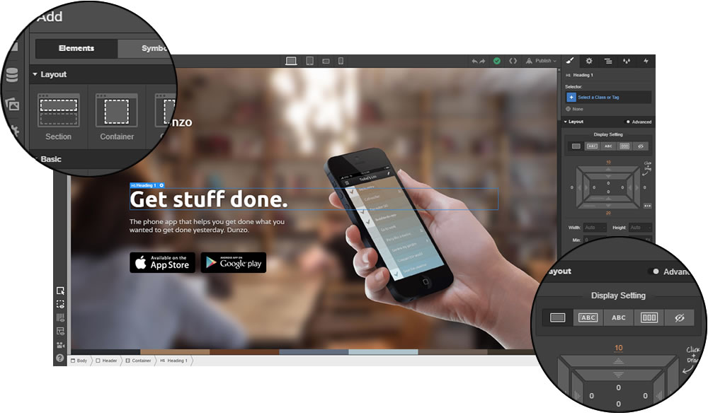
…but it also means you’ll need to understand how the web is structured (or at least be ready to learn).

The good news?

In 2025, Webflow offers 3 distinct ways to start your next website, on a scale from less to full hardcore mode:

  1. 🧠 AI Site Builder Beta This is the newest — and possibly most controversial — option:

    Describe the kind of website you want, pick a visual style, and Webflow’s AI will generate a complete homepage (or multi-page layout) with real sections, dummy content, and best-practice styling.

    Unique in 2025? No. But still great for quick wireframes, MVPs, or getting past „blank canvas syndrome“.

    The designs aren’t flawless, but they give you a clean base to iterate on — and everything stays 100% editable within the Designer.

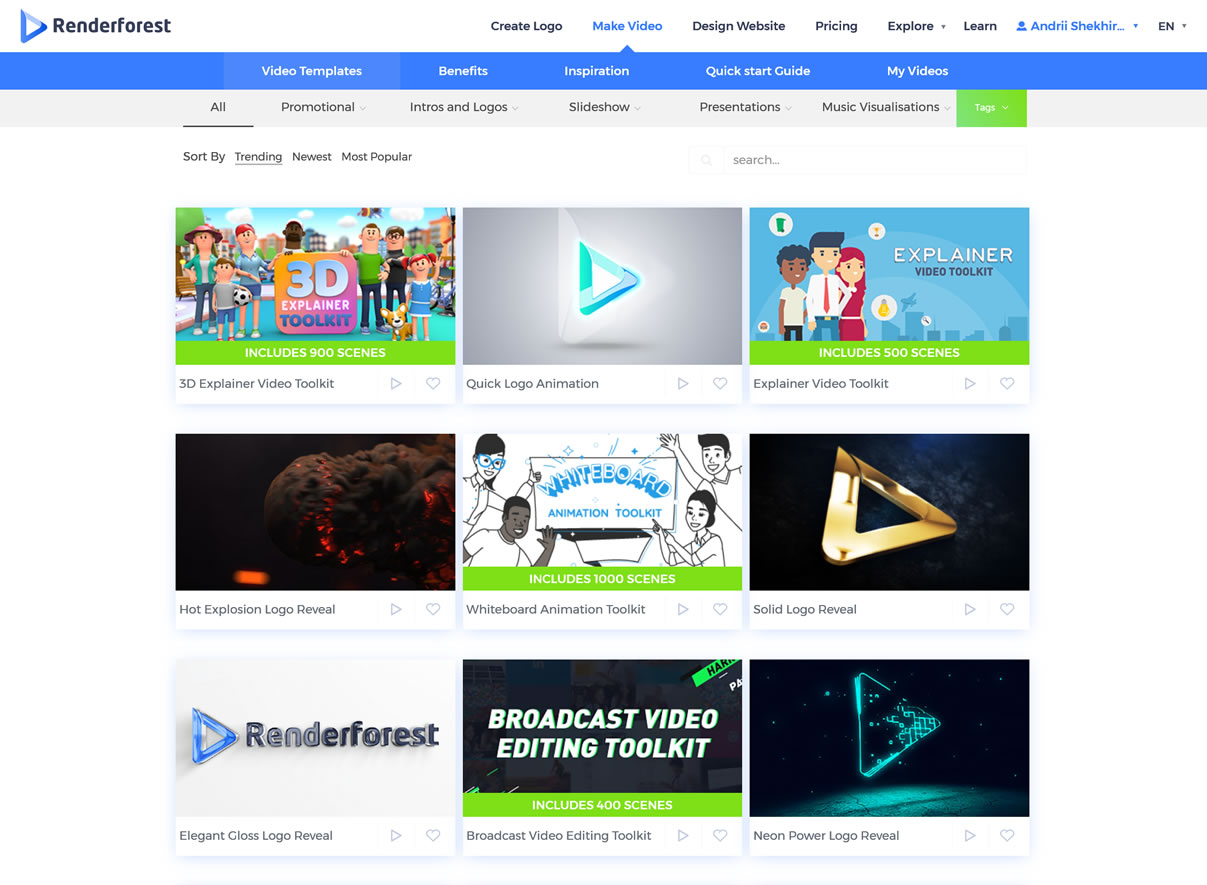
  2. 🎨 Start from a Template: if you want to skip setup and dive straight into customization, Webflow offers a library of 100+ templates (about 30 are free and the rest are paid).

    Some are minimal and fast-loading; others come packed with animations, CMS collections, and prebuilt pages – everything from simple themes for personal projects and practice – to premium templates ($40–80) created by third-party Webflow experts

    Each template is fully editable, of course = so you can tweak layout, colors, content structure, and responsiveness however you like.

  3. 💻 Blank Canvas (a.k.a. Real Webflow Mode): the classic Webflow experience – for those who want full creative and structural control.

    You start with a single empty page and drag in layout elements like Sections, Containers, Grids, Flexboxes, Div Blocks – as well as text elements, images, buttons, forms, videos, and custom embeds.

    Every pixel, margin, animation, and media query is under your control. But so is every responsibility — because you’re building the structure yourself:

    Want a centered box? Add a div, set it to „relative“, give it dimensions – welcome to the real web, baby.

If that sounds scary, don’t worry — Webflow has toggles and guardrails (like visual CSS controls and device views) that guide you as you go.

Explore Webflow Site Designer ›

The Interactions view lets you easily set up things like hover effects, scroll-based reveals, page load animations, and click/trigger-based transitions – no JavaScript required (you know, unless you want to!)

It is also worth mentioning that Webflow’s responsive design system is one of the best around:

  • Each layout breakpoint (desktop, tablet, mobile landscape, mobile portrait) is built-in
  • You can visually adjust styles for each screen size, and changes cascade down — just like CSS
  • You can even set custom breakpoints in addition or instead of the standard ones if needed

…and if you mark yourself as a non-coder during sign-up, it will even automate mobile styles for you!

Bottom line: whether you’re starting with AI prompts, a template, or the blank page – Webflow gives you the tools to make it truly your own.

Now let’s look at how Webflow handles structure:

Webflow’s Content Managemen System

A website isn’t just boxes and buttons – it’s all about content.

And Webflow’s CMS lets you structure that content like a pro – even if you’ve never touched a backend before 🫣

Unlike traditional site builders that treat everything as static blocks – or WordPress, where you pray your plugin stack doesn’t explode – Webflow gives you a visual but schema-based approach to managing content.

Think: Notion meets Airtable… but for websites.

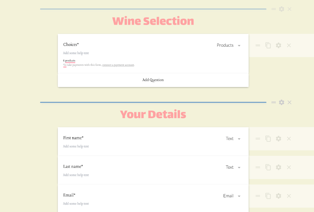
At the heart of it all are Collections – reusable content types that you can freely define based on your needs. For each Collection, you can define any number of properties, of fields.

For example:

  • Blog posts with title, author, publish date, featured image, tags, body
  • Portfolio projects with galleries, links, testimonials, and categories
  • Team members with roles, avatars, bios, and social links

Webflow CMS

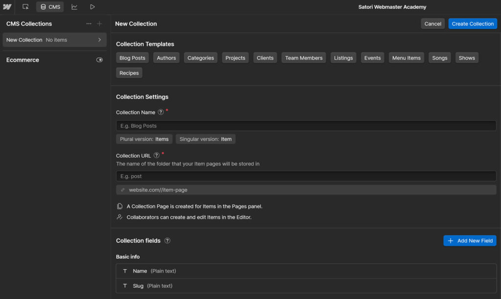
Once you’ve created a Collection, you can:

  • Auto-generate dynamic pages, for example /blog/how-to-make-webflow-dance
  • Display Collection items in any number of lists, grids, or sliders, as well as filter and sort content by any field
  • Use conditional visibility to show/hide layout blocks based on specific field data

Te best part – all of this is done visually: no databases, no PHP functions, and no „custom post type“ plugins.

…And for devs who still want data control – yes, Webflow’s CMS can connect to external tools via APIs and custom embeds.

The Webflow Editor

For live content editing (after your site is published), Webflow also offers the Editor – a front-end tool for content updates.

Think of it as a „client-friendly“ mode:

🖱️ Click any text or image on the live site to edit it
Add new Collection items without entering the Designer
🔒 Keep layout locked while letting non-techies update the content

Quite handy for solo creators, teams – or clients who want blog control without touching design.

Multilingual? Now Natively Supported

For years, multilingual sites were a pain in Webflow – requiring third-party tools like Weglot or hacky CMS workarounds.

But all that is in the past, with Localization 2.0:

🌐 Define languages and assign subdirectories (like /fr/ or /de/)
🈯 Translate individual fields, images, and SEO tags per locale
🔁 Switch language visually via dropdowns or dynamic links

Note that it’s a paid add-on right now – but it works out of the box and integrates deeply with the CMS, which makes it a huge step up.

Bottom line: Webflow’s CMS gives you 90% of what a headless CMS can do – without the head trauma.

Next step – publishing your masterpiece:

Deployment and Hosting

With Webflow, you just… click a button. Seriously – deployment is built right into the Designer UI:

– hit „Publish“, choose your staging (test) and/or production domain, and your site goes live in seconds.

Webflow publishing

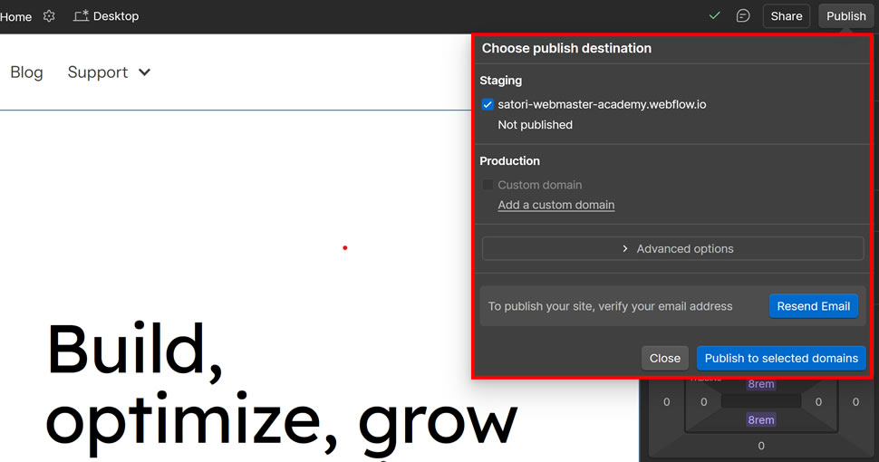
No cPanel. No FTP. No DNS nightmares (okay, maybe just once, but Webflow’s DNS panel is one of the cleanest out there).

You can publish to:

  • a 💸 free staging subdomain in the form of [yoursite].webflow.io
  • any custom domain via some DNS setup
  • multiple environments at once if you’re on higher-tier plans

Once deployed, your site runs on Webflow’s global infrastructure – let’s take a peek inside:

What’s Under the Hood?

Webflow Hosting is powered by Amazon Cloudfront and Fastly which deliver world-class performance, pretty much on autopilot:

  • Auto-scaling backend: no need to upgrade your server or do any manual actions during traffic spikes
  • Built-in SSL: every site gets a free and perpetual HTTPS certificate, activated automatically
  • Smart cache: your content updates go live across all regions in seconds, no cache management required

This isn’t shared or even managed WordPress hosting. It’s more like 🚀 managed enterprise-grade cloud – without the devops.

In this regard Webflow is closer to a site builder philosophy – no server management, no plugin updates, no compatibility patching, etc –

it just… works.

Bottom line: Webflow hosting gives you speed, scalability, and security without lifting a finger. Just click „Publish“ — and it’s live.

Next up: how easy is it to sell on Webflow?

Webflow eCommerce: Still a Work in Progress

One of the most requested features in Webflow’s history? Selling stuff.

And yes – Webflow eCommerce is now fully integrated into the platform. That means you can:

🏪 Create custom product pages
🛒 Build your own cart and checkout flows
🖼️ Design every inch of your online store – no rigid layouts
🎛️ Manage inventory, orders, taxes, and emails from the same dashboard

So… is it ready to take on Shopify?

Not quite — but it’s getting closer.

The main strength of Webflow eCommerce is the same as the rest of the platform: complete design freedom.

No rigid storefront themes. No plugin spaghetti. You design every single page — product, cart, checkout, even emails – like any other Webflow page.

This is a game-changer if you’ve ever fought with Shopify Liquid templates or WooCommerce CSS overrides.

Other nice touches:

  • Supports physical + digital products
  • Custom fields for variants, specs, downloadable files, etc.
  • Customizable checkout and thank-you pages
  • Branded email receipts and abandoned cart flows
  • Native Stripe + PayPal payment integration

For designers and product-focused brands who want pixel-perfect storefronts, this is a dream come true.

However, it’s still worth noting that as of 2025, Webflow eCommerce is still evolving – and some advanced features are missing or limited compared to Shopify or even WooCommerce:

  • No built-in multi-currency support
  • No POS (Point of Sale) integration
  • No native subscription products
  • Limited discount logic (incl. cart-level rules)
  • Customer accounts are only available through Memberships

Some of these features are on Webflow’s roadmap – but others may never arrive natively. So if you’re running a large store, or need serious ERP/POS logistics, use Shopify and sleep well.

But for smaller shops, one-product brands, digital sales, and custom storefronts with a strong visual identity – Webflow is still a very tempting option.

Bottom line: Webflow eCommerce is ideal for small-to-medium custom storefronts – especially when branding, design, and flexibility matter more than pure feature count.

Alright, now for the meaty part: let’s look at the pricing!

Webflow Pricing

Yes, Webflow’s plans are a mess. But it starts making a lot of sense once you get used to the underlying principles.

Here’s the important thing to understand:

Webflow uses a layered pricing system with two different components: workspaces for your overall account and sites for each individual project (i.e. websites you build).

To help make sense of all this, we’ve created this „master diagram“ explaining all of Webflow’s pricing plans in a more visual way:

Webflow pricing

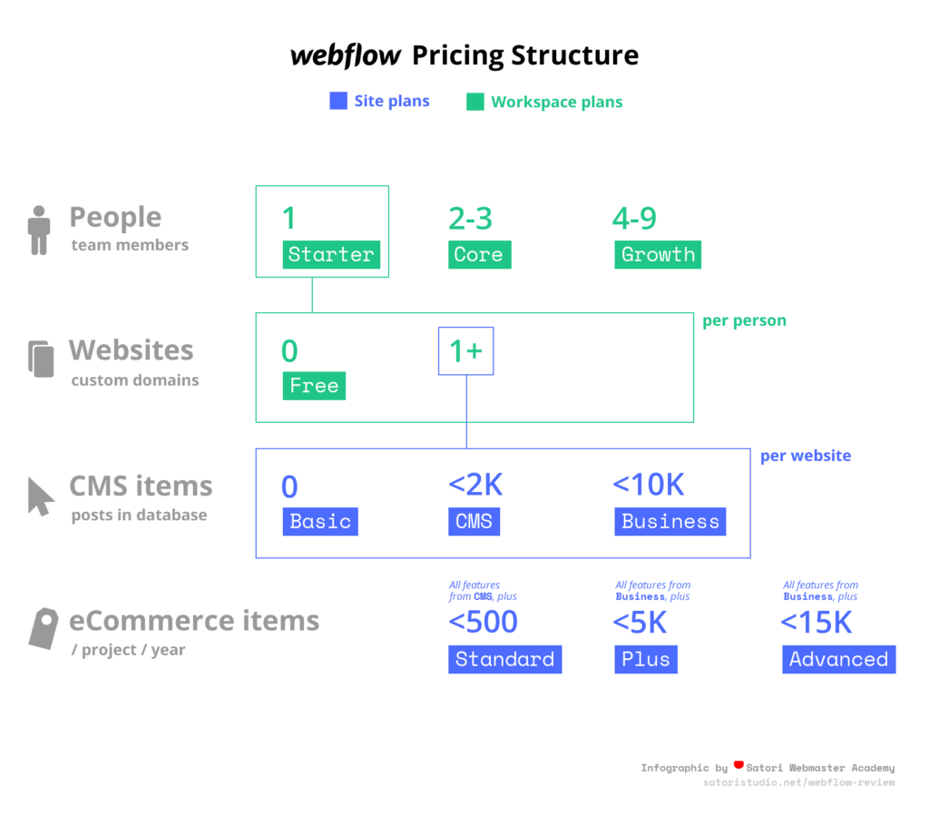
Workspaces are used to organize groups of sites with separate access and collaboration features – think agency-level project management.

When you sign up you get 1 workspace seat by default, to which you can add one or more sites.

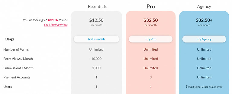
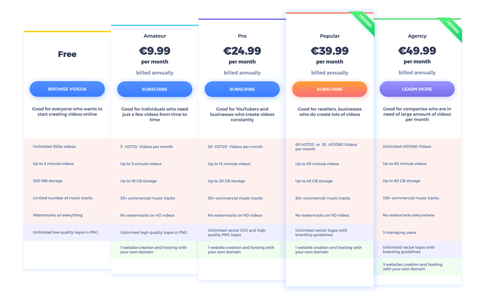
Site Plans (Hosting per Website)

The main difference is in how many static pages, CMS items, and max traffic you get:

  • Starter (Free): 2 pages, 20 CMS collections, 50 CMS items, 1 GB bandwidth, 50 form submissions (lifetime). No custom domain.
  • Basic – $14/mo: Ideal for small sites and landings; 150 static pages, unlimited forms, 10 GB bandwidth.
  • CMS – $23/mo: Best for blogs and content‑rich sites; adds 20 collections, 2,000 items, 50 GB bandwidth, site search, and 3 editor seats.
  • Business – $39/mo: For high‑traffic sites; 300 pages, 40 collections, up to 10,000 items, 100 GB+ bandwidth, file uploads, 10 editors.
  • Enterprise: Custom solution for large-scale needs — includes unlimited capacity, dedicated support & SLA. Contact sales to get a quote.

If you want to sell things on your website, you’ll need to use one of the three site plans for online shops:

eCommerce Plans (Add Store Functionality)

These are designed specifically for selling online – but still built on top of the above Site plans:

  • Standard – $29/mo: Up to 500 products, 2% transaction fee.
  • Plus – $74/mo: 1,000 products, zero Webflow fee.
  • Advanced – $212/mo: 3,000 products, 0% fee, team accounts, no limits on sales volume.

All include CMS, custom checkout/cart, emails, Stripe/PayPal, taxes, and basic integrations – key differences lie in how many products you can list and how much you pay in transaction fees.

Now let’s (carefully!) add the workspace layer:

Workspace Seat Plans (Team & Agency Access)

As we mentioned earlier, workspace seats determine who can collaborate on specific projects and with what level of access:

  • Free seat: View-only/reviewer access (e.g. content proofing or client corrections).
  • Limited seat – $15/mo: For content editors/marketers with restricted permissions.
  • Full seat – $39/mo: Full access — Designer, site settings, billing, the whole shebang.

Whew…

Alright, what if I need both Site + Seat? 🤔 Here are some basic principles:

  • A full team building high-end sites needs at least 1 Full seat + paid Site plan per project.
  • Simple personal sites can run solo on a site plan without buying seats.
  • Need to give editing permissions to a client? A Limited or Free seat may suffice for straight CMS updates.

Bottom line: It’s not cheap – but if you want pro-level design, hosting, CMS, and team collaboration in one bundled platform, Webflow’s pricing reflects that value – especially with the new seat flexibility as of 2025.

Pros and Cons of Webflow

Time for a sanity check. Here’s a no-BS overview of where Webflow shines — and where it still needs work:

  • Full visual control over layout and styling — no rigid templates, no code required (unless you want to)
  • Clean production-grade code output — exportable and dev-friendly
  • Built-in CMS with schema-based collections — perfect for blogs, portfolios, directories, and more
  • Best-in-class responsive tools — device breakpoints, mobile preview, cascading styles
  • Instant publishing to staging or custom domain — with no servers, FTP, or cPanel needed
  • Enterprise-grade hosting on AWS/Fastly with global CDN, built-in SSL, and auto-scaling
  • Native localization (finally!) — supports multilingual content and subdirectory-based language versions
  • Fully customizable eCommerce checkout, product pages, emails, and cart logic
  • Flexible pricing — build for free, scale later; new seat model makes team workflows more affordable
  • Active roadmap — major updates like Memberships 1.0, DevLink for React, and AI builder released in past 12 months
  • Steeper learning curve than Wix, Squarespace, or classic site builders — especially for total beginners
  • eCommerce still lacks depth — limited multi-currency, no native subscriptions, no customer accounts (outside Memberships)
  • Pricing complexity — separate plans for site, eCommerce, and workspace seats can be hard to decode at first
  • CMS item limits on lower-tier plans — easy to hit 2k or 10k item caps for large content-driven projects
  • No built-in backup/version history on CMS content (only for design elements)
  • Some integrations require 3rd-party tools (Zapier, Make, Memberstack) for advanced workflows or payments
  • Still limited plugin ecosystem — unlike WordPress, there’s no giant library of user-created add-ons (yet)

Overall, Webflow is a pro-grade platform for people who want precision, performance, and polish – not shortcuts or crutches. The price is higher, the learning curve is real, but the payoff is big.

Blitz: Frequently Asked Questions

Before we conclude with the verdict, here’s a compilation of the most popular questions we receive about Webflow:

What is Webflow?

Webflow is a hybrid website-building platform that merges the visual flexibility of a design tool with the control of custom code. It lets you create, manage, and publish fully functional websites – no coding needed, but with full code-level precision under the hood.

How much does Webflow cost?

Webflow uses a dual pricing system: account plans and site plans. Account plans manage how many projects or collaborators you can have, while site plans control each site’s hosting level. Prices range from free to $36/month depending on your needs—see our full breakdown in the pricing section above.

Is Webflow easy to use?

Webflow certainly has a learning curve, especially for first-time users. But once you get the hang of its layout and logic (which mirrors HTML and CSS structure), it becomes an intuitive and powerful visual development tool. It’s easier than hand-coding, but more advanced than traditional site builders like Wix or Squarespace.

Who is Webflow best for?

Webflow is best for designers, developers, agencies, and entrepreneurs who want full creative control without writing raw code. It’s also great for teams that need to collaborate on design, content, and publishing in one centralized platform.

Does Webflow support eCommerce?

Yes, Webflow includes an integrated eCommerce platform. You can build custom storefronts, manage inventory, design checkout flows, and send branded emails. While it’s still evolving, it already rivals many specialized platforms for customizability and UX. For more details, see the ecommerce section above.

Webflow vs WordPress: a replacement?

For many use cases, yes. Webflow replaces the need for WordPress plugins, themes, and manual hosting setup by bundling everything into a seamless, visual platform. However, WordPress still offers more plugin variety and community support for edge-case needs.

Alright… that was lot of information to take in! So what’s the bottom line? In other words –

Our Verdict: Should You Use Webflow in 2025?

After testing and building in Webflow since 2016, across dozens of projects and updates, here’s the final verdict:

Webflow is one of the most powerful website development options on the market — if you’re willing to climb the learning curve, it’ll reward you with pro-level tools, smooth workflows, and zero plugin headaches.

☝️ Mind you, it’s not for everyone –

If you want to slap together a one-pager in 10 minutes, or rely heavily on third-party integrations, WordPress or Squarespace may still be a better fit.

But if you care about:

  • design freedom without code,
  • clean front-end output,
  • a flexible CMS with native localization,
  • scalable hosting and eCommerce all in one place,

…then Webflow is definitely worth your time.

It’s a platform that seamlessly grows with you – from solo portfolio to agency client work to full-blown product sites with gated content and dynamic catalogs.

Try Webflow for Free ›

Thank you for taking your time to read our analysis of Webflow! Have you found this review helpful? Got something to add or disagree with certain points? Let’s discuss in the comments section below!

Some of the links in this article are affiliate links, which means we may earn a small commission if you choose to use them — at no extra cost to you. If you found this guide helpful, using our links is a great way to support the site. Thanks!

Cómo Elegir un Tema de WordPress en 2025 (Sin Volverte Loco)

☑︎ Esta guía ha sido actualizada para 2025

Elegir un tema de WordPress puede sentirse como entrar a un gigantesco almacén con 50.000 atuendos… y ningún maniquí.

Todos prometen velocidad, belleza, SEO, polvo de unicornio — pero ¿cuál realmente te queda bien?

En esta guía, vamos a desglosar:

  • qué es un tema en realidad (pista: es mucho más que “colores y tipografías”)
  • si te conviene elegir un tema gratuito o de pago
  • y las 8 cosas clave que deberías tener en cuenta al escoger el tema adecuado para tu web

Ya sea que estés lanzando un blog, creando un portafolio o renovando la página de tu empresa, esta guía te ayudará a evitar temas pesados, arrepentimientos estéticos y pesadillas con el soporte técnico — para que puedas concentrarte en hacer crecer tu sitio, no en criarlo como si fuera un Tamagotchi.

Vamos desde el principio:

¿Qué es un tema de WordPress?

Empecemos aclarando una confusión bastante común: un tema de WordPress no es solo cómo se ve tu sitio.

Es el motor visual completo detrás de tu web: distribución, tipografías, paleta de colores, estilo de navegación, formas de los botones, diseño del blog, adaptación a móviles… todo eso y más.

En términos técnicos, un tema está compuesto por plantillas, hojas de estilo y a veces un poco de JavaScript mágico que le indica a WordPress cómo mostrar tu contenido. Algunos temas son minimalistas; otros vienen cargados de demos, animaciones y plugins incluidos.

Pero aquí viene el truco:

No todos los temas son iguales — y además, están hechos para plataformas específicas. Un tema de Joomla no sirve para WordPress. Un diseño de Wix no se importa mágicamente a Drupal. Los temas están pensados para cada CMS.

Así que cuando hablamos de “tema de WordPress”, nos referimos a uno creado específicamente para WordPress. Y hay miles de ellos. Literalmente.

Lo que nos lleva al siguiente punto…

3 formas de diseñar una web (y por qué los temas ganan para la mayoría)

Supongamos que quieres lanzar un nuevo sitio web. A grandes rasgos, tienes tres opciones:

  1. Contratar a un diseñador + desarrollador 🧑‍💻 puede darte un sitio espectacular hecho a medida… si tienes varios miles de euros disponibles. Y aun así, no hay garantía de que sea fácil de mantener o actualizar, a menos que también presupuestes soporte continuo.
  2. Construirlo tú mismo desde cero 🔧 es genial si ya sabes HTML, CSS, JavaScript… y tienes el tiempo libre de un monje ermitaño. Si estás leyendo esta guía, probablemente tienes mejores cosas que hacer que depurar código a las 2 a.m.
  3. Usar WordPress + un tema 🎯 es el punto medio ideal para la mayoría: es rápido, asequible y se ve bien desde el primer momento.

¿Por qué los temas son el punto dulce?

  • Cuestan menos que una cena para dos — la mayoría de los temas premium rondan los $40–$80.
  • Están listos para usar — no necesitas diseñar cada página desde cero.
  • Muchos incluyen diseños prediseñados, contenido demo y plugins integrados (como sliders, formularios de contacto o constructores visuales como Elementor).
  • Los mejores temas están bien documentados e incluso incluyen soporte de los desarrolladores.
  • Puedes lanzar tu web en un fin de semana — y aún te queda tiempo para Netflix.

¿No sabes qué tema está usando un sitio que te gusta? Prueba nuestro detector gratuito de temas WordPress 🔍

…Muy bien, ya vimos por qué los temas son un atajo inteligente. Ahora hablemos de cómo elegir uno bueno.

Checklist: Qué buscar en un tema de WordPress

Hay literalmente miles de temas para WordPress — y la mayoría se ven geniales en la demo.

Peeeero… las apariencias engañan 😬

Aquí tienes una checklist honesta para ayudarte a evitar temas hinchados, rotos o simplemente malos:

✅ ¿Quién lo creó?

Quédate con proveedores de confianza — los que llevan tiempo en el mercado, tienen buenas reseñas y actualizan sus productos.

Recomendamos empezar con:

Estos marketplaces son altamente competitivos — lo que significa que los desarrolladores tienen todas las razones del mundo para mantener su código limpio, seguro y actualizado.

✅ ¿Se ve moderno?

El buen diseño evoluciona. Evita cualquier cosa que parezca salida del 2010.

Busca cosas como:

  • Diseño limpio con mucho espacio en blanco
  • Tipografías claras y legibles (nada de Comic Sans 😅)
  • Diseño adaptado primero a móviles
  • Animaciones mínimas (puntos extra si carga rápido)

Siempre prueba el sitio demo en tu móvil y tablet antes de comprar.

✅ ¿El estilo encaja con tu contenido?

Un tema blanco y negro minimalista no va a ayudarte si estás lanzando un blog de cocina 🍜

Pregúntate:

  • ¿Necesito grandes visuales o bloques de texto compactos?
  • ¿Busco minimalismo o algo con textura y color?
  • ¿Este tema fue creado pensando en el tipo de contenido que voy a publicar?

No adaptes tu contenido al tema — encuentra un tema que se adapte a tu contenido.

✅ ¿Está pensado para tu nicho?

A veces un tema genérico funciona. Pero si estás haciendo un sitio para un sector específico (fitness, derecho, inmobiliaria…), un tema especializado puede ahorrarte mucho trabajo.

Suelen incluir:

  • Íconos, tipografías y diseños específicos del sector
  • Plugins especializados (por ejemplo, reservas para salones, mapas de propiedades para inmobiliarias)
  • Contenido demo adaptado a tu caso de uso

Un tema de nicho bien hecho puede ahorrarte horas de configuración y ajustes.

✅ ¿Es rápido?

¿Un tema precioso que tarda 7 segundos en cargar? No, gracias.

La velocidad lo afecta todo — desde el SEO hasta la tasa de rebote… y tu salud mental.

Usa herramientas como:

para probar la página demo del tema antes de comprometerte.

Consejo profesional: un “precargador” animado puede verse genial, pero no sustituye a un código limpio y optimizado ⚠️

✅ ¿Incluye un constructor visual?

A menos que te encante maquetar a mano, querrás un tema que funcione bien con un page builder.

La mayoría de los temas premium actuales son compatibles con:

  • Elementor
  • WPBakery (antes conocido como Visual Composer)
  • El editor nativo de bloques de WordPress (también llamado Gutenberg)

Algunos incluso traen su propio constructor drag-and-drop. Solo asegúrate de que no te dejen atrapado con shortcodes raros si algún día decides cambiar de tema.

✅ ¿Está optimizado para SEO?

Fíjate en cosas como:

  • Estructura HTML limpia
  • Compatibilidad con Schema
  • Capacidad para establecer títulos y descripciones meta personalizados
  • Compatibilidad con plugins SEO como RankMath o Yoast

Usa SEO Site Checkup o el validador W3C para analizar la demo.

✅ ¿Se lleva bien con los plugins populares?

Como mínimo, asegúrate de que el tema sea compatible con:

  • WooCommerce (si vas a vender algo)
  • Contact Form 7
  • WPML (si planeas tener un sitio multilingüe)
  • El constructor visual que quieras usar

Puntos extra si el tema ya incluye estilos y diseños predefinidos para estos plugins.

¿Sientes que esto es demasiado? Tranquilo: no necesitas un tema “perfecto”. Solo uno que te lleve al 80% del resultado sin frenar tu sitio ni atarte de manos.

Y ahora, la pregunta del millón: ¿tema gratuito o de pago?

Temas gratis vs premium: ¿realmente vale la pena pagar?

Vamos a desmontar un mito desde el principio: que algo cueste dinero no significa automáticamente que sea mejor.

Hay algunos temas gratuitos para WordPress que son muy sólidos — de hecho, nosotros mismos hemos creado uno:
échale un vistazo a Bento si no lo conoces aún.

Entonces, ¿qué ofrecen los temas premium que los diferencia?

He aquí un resumen rápido de lo que normalmente obtienes con cada tipo:

  • Los temas gratuitos suelen ser ligeros, limpios… y básicos. Perfectos si quieres un blog o sitio simple sin florituras.
  • Los temas premium normalmente incluyen demos completas, múltiples diseños, widgets adicionales, plugins integrados y soporte dedicado.

Ese último punto merece énfasis: cuando tu diseño se rompe a medianoche y Google no te da respuestas, tener a un humano que responda en 24 horas puede salvar tu proyecto (y tu cordura).

Entonces, ¿cuál deberías elegir?

  • Ve por un tema gratuito si te sientes cómodo usando WordPress, no necesitas funcionalidades complejas y tienes tiempo para experimentar.
  • Ve por uno premium si quieres ahorrar tiempo, necesitas un diseño pulido desde el principio o simplemente no quieres pelearte con el código y los foros.

🧠 Piensa en esto así: los temas gratis son como IKEA — económicos y funcionales, pero haces tú todo el montaje.
Los premium son como una casa prefabricada bien diseñada — pagas un poco más, pero está casi lista para entrar a vivir.

En el fondo, ambos pueden hacer el trabajo. Solo depende de cuánta energía, tiempo y acabado visual quieras invertir.

Ahora veamos dónde encontrar buenos temas (sin perder medio día buscando).

Dónde encontrar buenos temas (sin perder horas)

Ahora que ya sabes qué buscar, la pregunta es:

👉 ¿Dónde se consiguen temas de WordPress que realmente valgan la pena?

Aquí tienes los 3 mejores lugares para empezar — todos verificados, populares y con actualizaciones constantes:

  • ThemeForest
    – el marketplace de temas de WordPress más grande del mundo. Miles de opciones, filtros potentes, reseñas detalladas. Solo ten ojo: no todos los temas son iguales.
  • Elegant Themes
    – conocidos por su famoso tema Divi y su constructor visual. Una gran opción si quieres un “sistema de diseño” con mucha flexibilidad y buen acabado.
  • TemplateMonster
    – un proveedor con años de experiencia y una buena colección de plantillas para nichos específicos. Ideal si buscas algo para un sector concreto.

También puedes echar un vistazo al directorio oficial de temas de WordPress — está lleno de opciones gratuitas que cumplen con los estándares básicos, aunque el soporte y las funciones pueden variar bastante.

💡 Consejo: si encuentras un sitio que te encanta y quieres saber qué tema está usando, prueba esto:
detector gratuito de temas de WordPress 🔍

Te dirá qué tema está activo — y en muchos casos, incluso qué plugins están activos.

Ya tienes las herramientas y el mapa.
Solo queda una pregunta: ¿estás listo para elegir tu tema?

¿Sigues con dudas? Te ayudamos a decidir

Si has llegado hasta aquí y aún estás dudando entre 2 (o 12) temas de WordPress… tranquilo, es totalmente normal.

✨ La buena noticia: no tienes que resolverlo solo.

Cuéntanos tu caso en los comentarios:

  • ¿Qué tipo de sitio estás construyendo?
  • ¿Qué funciones o estilo estás buscando?
  • ¿Tienes ya algunos temas en mente?

Te responderemos con sugerencias personalizadas — sin ventas, sin relleno, solo consejos reales de gente que ha probado demasiados temas para que tú no tengas que hacerlo.

¿Prefieres mantenerlo privado? También puedes escribirnos directamente desde nuestra página de contacto. En cualquier caso, aquí estamos para ayudarte.

En resumen: el “tema perfecto” es el que te permite poner tu sitio en línea rápido, que se vea bien para tu audiencia y no te dé dolores de cabeza técnicos dentro de seis meses.

Ya estás por delante de la mayoría solo por haber leído hasta aquí — ahora vamos a poner ese sitio en marcha 🚀

Full Review: the Best Value for Money Marketing Platform in 2025?

Email marketing is one of the most powerful ways of turning strangers into customers – how do you choose the right platform for your needs?

In this detailed review, we will look at Sendinblue in particular, seeking answers to the following questions:

  • 🦄What are the unique benefits of Sendinblue?
  • 💳How does pricing compare to its competitors?
  • ✔️What are the pros and cons of this platform?
  • 🏆Is this email marketing service really for you?

Before we go into details about what makes Sendinblue special, let’s quickly go over the basics, just in case:

Sendinblue is a marketing automation platform that helps small and medium-sized businesses grow their customer base and profits.

Far from being just an email sending service, Sendiblue includes tools for SMS marketing, live chatting, and social media marketing.

To top that off, a built-in customer relationship management system allows organizing your contacts and leads as you guide them through the conversion funnel.

What’s Unique About Sendinblue?

Let’s face it – common features like drag-and-drop email design builder, mobile-friendly email formats or contact segmentation won’t help you decide whether or not Sendinblue is the right fit for your needs.

With that in mind, we’ll only look at the features that differentiate this platform from its competitors:

  • Affordable pricing is probably the most notable thing about Sendinblue – the service manages to stay below market prices, while offering comparable quality.

Sendinblue is by far the cheapest service when it comes to bulk emailing, which is the biggest contributor to the price you pay for using such a platform (see the comparison section for more details).

  • Free transactional emails is another feature that’s hard to find elsewhere: at Sendinblue, you get a free quota of up to 100 such emails per hour with any plan, including the free one!

To clarify – those are automated customized emails that can be used for things like order confirmations, shipping notifications, delivery confirmations or password resets.

Oh, and since we’re on the subject on free stuff, it’s worth mentioning one more feature that makes Sendinblue stand out:

  • Unlimited contacts for any plan mean there’s no upper limit for the number of clients you can store in your account.

As you can see, Sendinblue’s strategy is to more or less beat everyone else when it comes to value for money 💸

In the following sections we’ll look at the pricing plans in more detail and then make a visual comparison of Sendinblue with its main alternatives:

Sendinblue’s Plans and Pricing

No doubt about that –Sendinbluestrives to price its packages with a clear vision of meeting the needs of small and medium-sized businesses.

There are 3 plans available for this niche, and then there’s the custom Enterprise plan for larger businesses, as well as a Lite+ addon which we’ll count as a separate plan for the sake of clarity:

Plan Base price Key Feature Email limit
Free Free! Costs zero money 300 per day
Lite $25/month No daily limit 10K-100K per month
Lite+ $37/month Custom branding 10K-100K per month
Premium $65/month >1 account users 20K-1M per month
Enterprise Upon demand More of everything As many as needed

Note that the „base price” means how much a plan costs with the minimum available email limit – for example 10K per month for the Lite plan.

Let’s take a closer look at each plan:

  • The Free plan is most suited for entrepreneurs with a smaller list of contacts, allowing them to send a maximum of 300 emails per day.
  • On the Lite plan there’s no daily limit – instead, you pay a base price for the package of 10,000 emails per month, which can be increased at additional price if you need more.
  • The Lite+ addon costs $12 on top of the Lite plan and unlocks advanced statistics, A/B testing, and – most importantly – allows you to replace the Sendinblue logo with your own.
  • The Premium plan provides a set of additional tools including a Facebook Ads manager and a landing page builder; moreover, it allows adding up to 10 account users – a must-have for larger marketing teams.
  • Finally, the Enterprise plan is a personalized solution for larger companies with pre-existing mailing lists and specific needs. You also get a personal manager at Sendinblue to help you optimize your marketing campaigns.

In all plans (including the free one), you get a powerful 📧 email automation platform with unlimited contacts, easy-to-install 💬 live chat for your customers, and 📊 real-time analytics.

So, which one should you choose?

– unless you need any of the specific features like your own logo in the email or more than one account user, the decision depends on the size of your contacts list and the number of emails you need to send per day/month. As simple as that!

Try Sendinblue for free

How about other similar platforms? Is it worth considering Sendinblue over its competitors? To answer that, we’ll need some graphs:

Sendinblue Versus Alternatives

It’s not so easy to compare marketing automation platforms, not least because the pricing varies wildly depending on parameters like number of contacts and/or emails sent per month.

(Sometimes it feels like they do that on purpose 🤐 but that’s a topic for a different discussion.)

The closest we can get to a meaningful comparison is by looking at the cost of regularly emailing a certain sized contact list.

Since Sendinblue is the only service that offers unlimited contacts at no cost, we have to take into account the possibility to send at least 1 email to each of those contacts per month.

Is it even worth the time?!

You’ll be surprised…

To make life easier for you, we’ve built the following visualization based on the publicly available price calculators for Sendinblue and two of its direct competitors:

Sendinblue vs Mailchimp vs ActiveCampaign

On the horizontal axis we have the number of contacts and on the vertical axis we have the monthly price.

We can make at least three important conclusions from this graph:

  • With smaller contact lists (below 500 contacts) Sendinblue doesn’t offer any significant advantages since most other services are also free at this point.
  • As your contact list (and emailing needs) grows, Sendinblue quickly becomes the most affordable alternative – already at 5,000 contacts it’s more than 2x cheaper than the closest competitor!
  • With larger audiences (over 50,000 contacts/emails) you can save hundreds of dollars each month on Sendinblue.

Given that Sendinblue offers many other, normally premium tools for free – like advanced segmentation, transactional emails, and live chat – the choice seems quite obvious.

Pros and Cons of Sendinblue

Before we move on to the final verdict, let’s take a step back and summarize the advantages and weaker points of Sendinblue:

  • Being much more than an emailing service, Sendinblue lets you take your marketing to the next level with the help of complementary tools like live chat, SMS, and Facebook ads.
  • When it comes to email automation, it’s difficult to find a more affordable solution – serious savings guaranteed, regardless of the size of your contact list.
  • You can store unlimited contacts regardless of your plan (even on Free!), which means you only pay for what you send.
  • The heat map feature is really useful for analyzing click patterns and optimizing your emails (available in the Premium plan).
  • There are more than 60 different email templates available for all Sendinblue users at no cost – considerably more than other platforms offer on their free plans.
  • Being the only platform that grew out of Europe, Sendinblue takes data protection seriously: all tools are designed in alignment with the latest data protection principles (GDPR).
  • Transactional emails (great for automated notifications) are included free of charge with any Sendinblue plan.
  • Landing pages are offered only starting from the (second-most expensive) Premium plan. The only plan that offers unlimited Landing Pages is Enterprise.
  • The platform currently only enables users to create ad campaigns for Facebook (and Instagram). You can’t use Sendinblue to target audiences from other channels such as Google or Twitter.
  • The choice of third-party integrations, while constantly growing, is still not as extensive as with some other marketing platforms.

Should You Use Sendinblue?

As we’ve seen above, Sendinblue is quite unique among marketing automation platforms, with its relentless focus on affordability and value for money.

With that in mind, here are some cases when it’s definitely worth trying Sendinblue:

  • New projects – you are just starting to grow your audience and want a powerful free marketing tool that can grow with your business.
  • Pay for what you send – you don’t want to be charged for the size of your contact list, especially if you’re not emailing all of them all the time.
  • Cost conscious – you want to minimize your emailing expenses, while still having access to a diverse set of marketing and analytics tools.

In any case, it’s very easy to test the platform by starting with the Free plan, which can accommodate any number of contacts and has a 300 emails/day allowance:

Try Sendinblue for free

On the other hand, Sendinblue may not be the right email marketing solution for you if one of the following is true:

  • Exotic integrations – you are actively using services for which Sendinblue doesn’t offer integrations.
  • Maximum tools – you prefer to have access to as many advanced reporting and audience management tools as possible.
  • Website and ecommerce – you are looking for a marketing automation solution that lets you build a basic website or online store on the same platform.

Still unsure whether Sendinblue is right for you? Or maybe you’ve already tried it and want to share your impressions? In any case, leave a comment down below – let’s help each other make the most informed decision!

Renderforest Review: a One-Stop-Shop Media Creator for Your Online Business in 2025

Are you in search of an easy tool that can help you create professional-looking logos, promo videos, animations, and slideshows? Didn’t even know such tools existed?

In any case, if you’re considering or already managing a website, there’s no way you can avoid the need of producing brand-related images and videos for your project.

So, today we’re going to review a popular online media editing platform called Renderforest. The tool is getting positive reviews on Trustpilot, as well as social networks – which means it’s high time we figured out:

  • 🎓Can you use Renderforest if you have no prior experience?
  • 💡Which RF tools offer the best value for online projects?
  • 🔧How does their site builder compare to established brands?
  • 💵Which pricing plan should you choose at Renderforest?
  • 👍What do the 10 million existing clients like about RF?

This review will examine the various features of Renderforest to arrive at the final verdict: whether it’s worth using RF for your next online project.

First things first though –

What Is Renderforest?

As you’re probably guessed by this point, RF is an all-in-one tool that lets you create videos, logos, intro videos, slideshows, infographics, and animations.

And it all happens on a single platform – fully browser-based and requiring no subscriptions to start.

The whole idea of Renderforest is empowering anyone to create quality media for their business quickly and rather effortlessly (or at least with a much shallower learning curve than Photoshop or Pinnacle).

The tool has a pretty simple user-interface, making even novices capable of using it without any prior training.

Another thing that makes this tool unique from its competitors is the sheer choice of templates, meaning you can start immediately, working up from the existing samples.

Renderforest in numbers

Moreover, as the platform is cloud-based, the entire editing process is performed online. Neat, but not too exciting in our day and age.

To understand what makes Renderforest stand out from alternative tools, let’s analyze the parts of its toolkit one by one:

The Logo Wizardry

A logo is not merely an image; beyond this, it is a unique identity of your brand that helps you get recognition. A well-crafted logo makes a strong first impression and draws the attention of your potential customers.

In other words, a good logo conveys a slew of messages: your brand is trustworthy, professional, and offers quality services.

And yes, nowadays there are plenty of tools available online to create an eye-pleasing logo. However, not all tools are equal in terms of quality and user-friendliness.

Renderforest Logo Maker

Speaking of Renderforest, the tool claims to help you create a professional looking logo within a few minutes. The company says they use Machine learning algorithms that help them deliver the best design options to users (to be frank, we didn’t see anything that a purely algorithmic tool like LogoDesign.net could not do).

Let’s see how it goes.

The few simple steps to create a logo with Renderforest are quite straightforward:

  1. Go to their Logo Maker, and write down the name of your brand and then hit the „Create My Logo“ button.
  2. The next step will ask you for a few lines about your brand – this does not influence your results, but will help generate more lifelike imagery and mockups.
  3. Next, you can select among six general stylistic directions for your logo, like “minimalist”, “flat”, or “watercolor”.
  4. Now you can edit the different elements of your logo, including the font, the icon, and the layout. If you don’t like what you see, you may click on „Create from blank“ option to do it yourself.
  5. The last step will let you choose the download option – the free version is low-quality, but still works perfectly fine for a pitch or team discussion. For production logos, a plan with high-definition rendering is of course recommended.

Voila! It’s so smooth it almost looks like wizardry (and technically it is, because it’s a logo-making wizard, get it?).

Does it use machine learning? Unlikely, since we’ve gotten the same suggestions from using very different.

Does it mean it’s no good? Au contraire, the tool is definitely a great help for those who don’t own an expensive Adobe subscription or want to pay hefty sums to graphic designers.

Is their video maker up to the standard?

Creating Videos with Renderforest

Yes, at RF you can easily create a high-quality video without knowing a thing about (or paying for) professional editing software.

To start with, there are free video templates that help you create intro videos and product explainer videos.

If you want to give your video marketing a unique touch, you may use their 3D explainer video toolkit that has over a thousand of animated scenes. You may sort these scenes by options like „Most Popular“, „Trending,“ or „Newest.“

Similar to logo creation, the steps to video creation are quite simple. You need to choose a template, edit your project online, download it, and hit the publish button. Your video is now ready to use!

Renderforest has a stock gallery of commercial videos that you can easily remix and edit without going through any complicated interfaces.

Renderforest video templates

Apart from this, they have more 195.000 high definition royalty-free stock footage that you can use to make your video more professional and appealing.

And of course don’t forget a sound library for those finishing touches to your new video – btw this option allows you to upload your own music as well.

Renderforest as a Site Builder

Alright, you’ve got your cool new logos and videos, now for something to use then on…

Along with the media, Renderforest enables you to design a full-fledged website with the help of their page builder.

The tool is mostly geared towards landing pages, but you can also use it to construct an entire website if you wish – directly in your browser without any coding skills:

  • Renderforest has more than 100 ready-to-use templates for every conceivable purpose, from business and marketing to beauty and photography.
  • The visual editor is simple and minimalist, letting you focus on the essentials. You can make your site live within a few hours without any professional assistance.
  • Not sure this needs to be mentioned nowadays, but the templates are of course fully responsive, that means your website will function properly on all mobile devices, laptops, and desktops.
  • You can create multiple pages and bind them into a navigation menu for a full-blown website. The CMS/structure features are quite basic at Renderforest, so if you really need different content types and all such, WordPress is the preferred option.

Once you’re done, you can publish the website onto an RF subdomain for free or choose the paid plan for a custom domain name, branded email, more storage, and no ads (which is the only option you should consider for live websites that wish to look anything close to professional).

Sounds easy? Because it is! Nothing terribly advanced, so if you’re a professional web developer/designer, you shouldn’t be reading this :)

For everyone else, Renderforest offers a refreshingly simple and stripped-down (in a good sense) version of a visual site builder that lets you get online fast – and finally have somewhere to put that new fancy logo we generated earlier!

Plans and Pricing

Since RenderForest offers several different products, you are able to choose between a bundled option and individual tools. The respective toggle can be found on top of their official pricing page.

The former is suitable for those who intend to use the service on a regular basis: the Free plan offers unlimited low-quality videos and logos, while the progressively more pricey Amateur, Pro, and Popular plans unlock access to HQ media as well as the website builder.

Renderforest plans

The per-product plans are made for those who wish to use RF only once or twice – otherwise it becomes more lucrative to use the abovementioned subscription option.

The logo and video creation tools each has 4 plans, with the free version leaving a watermark on your video or rendering a low-fidelity PNG logo. The paid options allow you to remove the watermark and increase the quality of the render per your desired parameters.

The Website Maker is also a freemium model, with the paid plan giving you more storage and allowing to publish your site on a custom domain instead of the Renderforest subdomain.

User Satisfaction and Support

What about support, though? After all, regardless of the number of neat features, users will be looking for software that fulfils their needs, and that includes getting help and solving issues when they arise.

Support is available via the phone, by email, or using the contact form on the official RF website. There’s no live chat at the moment, but all the mentioned options are typically more than enough for most of your support needs.

Response time is short, and the team does their best to be as helpful and friendly as possible. In any case, with the tools that are that simple, you are unlikely to encounter too many questions or issues while using the product.

Having helped create over 10 million videos and logos, Renderforest can now boast being a part of G2’s list of the World’s top 100 software companies.

G2 is a global ranking platform that uses proprietary algorithms to assign scores to tech companies based on various customer satisfaction metrics from user reviews, social networks, and other online sources.

Being present on their top-100 list is an indicator of persistently high user opinions about the company and their products.

Should You Use Renderforest?

Time for the final verdict: who should use Renderforest, and is it worth opening your wallet for the paid features?

To recap, RF is a freemium online tool that lets users create videos for YouTube audiences, music visualizations, presentations, corporate slideshows, and other branded media.

The main advantages of Renderforest are definitely simplicity and cost savings: it gives you the freedom to create without asking for hours of training or subscription fees.

Big-budget online projects and advanced webmasters who know how to use tools like Figma and Resolve are unlikely to find anything they haven’t seen before.

For the rest of us bootstrappers and daredevils, Renderforest is a convenient all-in-one platform for fast, easy, and inexpensive media prototyping that definitely deserves a try.

***

Have you already used Renderforest? Any thoughts or questions? Hit us in the comments section below, let’s discuss!

Cum Să Faci un Website în 2025 (Chiar dacă nu ești sigur că ai nevoie de unul)

☑︎ Ghid actualizat pentru 2025

Deci vrei să faci un site web.

Poate e pentru un proiect personal, pentru afacerea ta, pentru portofoliul tău de freelancer… sau poate doar vrei o bucată din internet care să-ți aparțină 100%.

Oricare ar fi motivul — felicitări! Ești deja cu un pas înaintea majorității, pentru că îți pui întrebarea corectă: ok, dar de unde naiba încep?

Vestea bună e asta:

⚡NU trebuie să știi programare.
⚡NU trebuie să angajezi un developer.
⚡Și cu siguranță NU trebuie să spargi banca.

Ghidul ăsta te va conduce prin proces pas cu pas, într-o limbă pe înțelesul oamenilor – fără jargon, fără tehnicalități inutile, fără „doar instalează Nginx și modifică-ți fișierul DNS”.

De fapt, până la finalul acestui articol vei ști exact:

  • Dacă chiar ai nevoie de un site complet (spoiler: uneori nu ai!)
  • Ce variantă se potrivește cel mai bine nevoilor tale: Wix? WordPress? Framer? Altceva complet diferit?
  • Ce pași trebuie să urmezi — și în ce ordine — ca să treci de la zero la „gata, e online!”

Hai să-i dăm drumul.

Pasul 0: Ai Nevoie cu Adevărat de un Website?

Să fim sinceri — în 2025, a avea un website nu mai e întotdeauna mișcarea standard.

În funcție de ce vrei să faci, un site complet s-ar putea să fie prea mult… sau chiar o distragere inutilă.

Așa că înainte să sari direct în nume de domenii și editoare drag-and-drop, hai să punem întrebarea care chiar contează:

Am într-adevăr nevoie de un site — sau există o cale mai rapidă, mai ieftină și mai deșteaptă de a-mi atinge scopul?

Iată un mic ghid rapid:

  • Vrei să-ți construiești un brand personal sau o prezență profesională online? Un site încă e rege.
  • Lansezi un produs nou sau un startup? Site-ul devine cartierul general.
  • Ești freelancer sau consultant? Clienții vor încerca să te găsească pe Google.
  • Ai un business fizic (cafenea, salon, etc)? Un site inspiră încredere și ajută cu programări + direcții.

Dar alteori…

  • Vrei doar să-ți prezinți arta sau fotografiile? Un profil de Instagram sau Behance s-ar putea să fie mai rapid.
  • Vrei să vinzi câteva produse digitale? Un cont de Gumroad sau Lemon Squeezy ar putea fi suficient.
  • Ai ceva de spus, de împărtășit? Medium sau Substack îți oferă public fără bătăi de cap cu setări.
  • Ai nevoie doar de un „link în bio”? Folosește Carrd, Linktree sau Beacons și gata treaba (vezi mai multe în capitolul ăsta)

Încă nu știi sigur? Iată o regulă generală simplă:

  • Dacă îți pasă să deții controlul (și să nu depinzi de un algoritm sau de regulile unei platforme), fă-ți un site.
  • Dacă vrei rapiditate, simplitate sau zero mentenanță — începe cu o soluție găzduită sau o platformă socială și upgradează mai târziu, dacă va fi cazul.

Iar concluzia e asta:

Un site îți oferă libertate maximă, personalizare totală și flexibilitate pe termen lung. Dar e perfect ok să începi mic — și să revii la varianta completă când te simți pregătit.

Presupunând că ești încă în tabăra „am nevoie de un site” –
Urmează: hai să vedem ce tip de website ți se potrivește cel mai bine.

Pasul 1: Alege-ți Calea pentru Website

Deci ai decis că merită să-ți faci un website. Super.

Urmează întrebarea mare:

Ce fel de site ar trebui să fac — și cum îl construiesc?

Răspunsul depinde de ce vrei să faci cu site-ul tău, cât control îți dorești și cât timp (sau bani) ești dispus să investești.

Ca să simplificăm, am grupat metodele populare în trei mari categorii:

  • Website builders precum Wix, Squarespace sau Weebly – perfecte dacă vrei ceva vizual, rapid și fără bătăi de cap.
  • WordPress (self-hosted) – cea mai bună opțiune dacă vrei control total, flexibilitate și un ecosistem uriaș de teme și pluginuri.
  • Website builders moderne, fără cod – cum ar fi Framer, Typedream sau Carrd – excelente pentru landing pages, site-uri personale sau MVP-uri de startup.

Hai să le comparăm rapid:

Tip Platformă Ușurință în Folosire Control Design Cost Ideal Pentru
Website Builders clasici ⭐⭐⭐⭐⭐ ⭐⭐⭐ $–$$ Portofolii, afaceri mici, ateliere locale
WordPress (self-hosted) ⭐⭐ ⭐⭐⭐⭐⭐ $ Bloguri, proiecte scalabile, SEO
No-Code Builders ⭐⭐⭐⭐ ⭐⭐⭐⭐ $ Startups, site-uri personale, MVP-uri rapide

Încă nu e clar? Gândește-te așa:

  • Vrei ceva rapid și simplu? → Încearcă un builder (vezi comparația noastră aici).
  • Vrei flexibilitate pe termen lung și performanță SEO? → WordPress e alegerea potrivită.
  • Vrei ceva care arată wow direct din cutie? → Uită-te la Framer sau Typedream.

Mai departe: hai să luăm fiecare opțiune pe rând ca să vezi exact care ți se potrivește — fără presupuneri.

Opțiunea A: Website Builders

Dacă vrei să fii online rapid — fără să scrii niciun rând de cod — website builders sunt prietenii tăi cei mai buni.

Aceste platforme se ocupă de tot: găzduire, design, actualizări și chiar conectarea domeniului. Totul e împachetat frumos într-un format prietenos pentru începători.

Doar tragi, scrii, dai click pe „Publică” — și boom, site-ul tău e live.

Iată câteva dintre cei mai buni jucători din ligă:

  • Wix – cel mai versatil builder. Sute de șabloane, editor puternic și un marketplace uriaș de aplicații.
  • Squarespace – cunoscut pentru șabloanele elegante și vibe-ul minimalist. Ideal pentru creativi și portofolii.
  • Weebly – simplu, solid și foarte accesibil. Deținut de Square, deci vine cu ecommerce inclus.

Cui i se potrivesc astfel de unelte?

  • Vrei un site care arată bine fără să angajezi un designer
  • Vrei să-l lansezi repede (gen, în aceeași zi)
  • Preferi să plătești câțiva dolari/lună decât să te stresezi cu actualizări, securitate sau hosting

Dar există și câteva minusuri de luat în considerare:

  • Ai mai puțin control asupra SEO-ului, vitezei și codului personalizat (comparativ cu WordPress)
  • Schimbarea platformei mai târziu poate fi dureroasă — migrarea e complicată
  • Unele funcții sunt blocate în planurile scumpe (ex: ecommerce, membri, analytics)

💡 Sfat practic:

Cei mai mulți builders oferă planuri gratuite sau trialuri — deci poți testa totul fără să plătești. Dacă nu știi cu ce să începi, alege Wix sau Squarespace — ambele sunt opțiuni solide pentru orice nivel.

Dacă vrei să aprofundezi subiectul și să compari în detaliu, aruncă un ochi pe analiza noastră dedicată.

Urmează: vrei mai mult control și flexibilitate? Atunci poate ești genul WordPress 🌞

Opțiunea B: WordPress (Self-Hosted)

Dacă website builders sunt ca și cum ai închiria un apartament complet mobilat 🛋️, atunci WordPress self-hosted e ca și cum ai cumpăra un teren și îți construiești exact ce vrei tu pe el 🏡

Da, necesită ceva mai multă configurare — dar flexibilitatea e incomparabilă.

Peste 40% din toate site-urile din lume folosesc WordPress. De la bloguri personale și portofolii până la magazine online și imperii media — toate folosesc WP.

De ce e încă atât de popular?

  • Este 100% gratuit și open-source (plătești doar hosting + domeniu)
  • Poți instala orice temă sau plugin pentru design sau funcționalitate
  • Excelent pentru SEO, optimizare viteză, blogging și scalare
  • Deții și controlezi totul – fără reguli impuse de vreo platformă

Dar există și reversul medaliei:

  • Nu e all-in-one – trebuie să alegi un provider de hosting (de ex. Hostinger – și da, te ajutăm să alegi)
  • Există o anumită curbă de învățare, mai ales dacă e prima dată când construiești un site
  • Va trebui să te ocupi de actualizări, backup-uri și mentenanță (sau să instalezi pluginuri care fac asta pentru tine)

Cu toate astea, WordPress a devenit mult mai prietenos în ultimii ani – mai ales cu ajutorul unor unelte precum:

  • Page builders gen Elementor, Spectra sau Kadence Blocks (drag-and-drop fără cod)
  • Teme de pornire care arată bine direct din cutie – cum sunt Astra, Neve sau Blocksy
  • Instalatoare one-click la majoritatea firmelor de hosting – îți pun totul la punct automat

Pe scurt, WordPress este 🏆 ideal pentru bloggeri, creatori, firme de servicii, agenții și oricine vrea să-și dezvolte site-ul pe termen lung — fără să dea de limitele unei platforme închise.

Urmează: vrei ceva și mai minimalist, stylish sau startup-ish? Hai să vedem ce pot face builder-ele moderne fără cod.

Opțiunea C: Website Builders Moderne, Fără Cod

Dacă builder-ele clasice ți se par cam greoaie — iar WordPress e prea mult angajament — s-ar putea să-ți placă noul val de unelte slick fără cod.

Aceste platforme sunt create pentru viteză, simplitate și stil — preferate de indie makers, startup-uri și oricine vrea să lanseze rapid un site cu un look profi.

Gândește-te la site-urile alea „cool de startup” — dar fără să plătești un designer sau să scrii o linie de cod.

Iată câteva nume care merită urmărite:

  • Framer – rapid ca fulgerul, orientat spre designeri, cu animații superbe și layout-uri responsive direct din start.
  • Typedream – Notion transformat în platformă de site-uri. Curat, minimal, super ușor de folosit.
  • Carrd – regele MVP-urilor. Ideal pentru pagini personale, portofolii sau link-in-bio. Planurile încep de la 9$/an (da, pe an!).

De ce ai alege un builder no-code?

  • Se instalează foarte rapid – uneori în mai puțin de o oră
  • Arată super modern — design fain, responsive, animații incluse
  • Funcționează excelent pentru one-pagere, landing pages, portofolii sau site-uri simple de startup

Dar sunt și câteva lucruri de știut:

  • Nu sunt potrivite pentru site-uri complexe, bloguri mari sau funcționalități personalizate
  • Ești oarecum limitat de stilul vizual al platformei (mai ales la Typedream și Carrd)
  • Funcțiile avansate (formulare, analytics, scripturi custom) pot necesita upgrade-uri sau workaround-uri

💡 Sfat util:

Builder-ele fără cod sunt excelente pentru a testa rapid o idee — creezi un landing page, validezi o ofertă sau faci un one-pager pentru proiectul tău, fără să investești într-un site complet.

Urmează: ai ales platforma – acum hai să vedem ce pui efectiv pe site.

Pasul 2: Structurează și Planifică-ți Conținutul

Înainte să începi să tragi widget-uri sau să alegi fonturi, e util să știi ce vrei să spui efectiv pe site-ul tău.

Gândește-te la pasul ăsta ca la o schiță 📋 înainte de a construi casa. Vestea bună? Nu trebuie să o complici. Hai să o luăm pe bucăți:

🔹 Pagini vs Articole

Dacă folosești WordPress (sau orice altceva cu funcție de blog), vei vedea două tipuri de conținut: pagini și articole.

Diferența e simplă:

Pagini Articole
Conținut static (Despre, Contact, Servicii) Postări datate sau noutăți
Fac parte din structura principală a site-ului Afișate într-un blog sau flux de știri
Organizate prin meniuri Organizate prin categorii și etichete

💡 Gândește-te la „pagini” ca la lucrurile permanente, iar „articolele” ca la conținutul care apare în timp (update-uri, tutoriale, studii de caz etc).

🔹 Pagini Esențiale Pentru Majoritatea Site-urilor

O structură clasică de început pentru un site mic arată cam așa:

  • Homepage – cine ești, ce faci, cum poți ajuta
  • Despre – povestea ta, valorile, echipa
  • Servicii / Proiecte / Produse – ce oferi, cu link-uri și (opțional) prețuri
  • Contact – cum pot oamenii să te găsească (formular + email + link-uri utile)
  • (Opțional) Blog – dacă vrei să publici articole, noutăți sau opinii

Nu trebuie să scrii tot acum — doar fă o schiță rapidă pentru fiecare pagină. O listă cu bullet points e suficientă.

🔹 Sfat: Fă-ți Harta Site-ului

Ia o foaie și desenează-ți site-ul ideal – căsuțe pentru pagini, săgeți pentru linkuri.

Serios. Chiar și în 2025.

Te vei mira cât de clar se face totul în capul tău.

Poți folosi și unelte gratuite ca Figma (pentru wireframes) sau Octopus.do (pentru sitemaps rapide).

După ce ai 🗺️ trasat ce merge unde, ești gata să treci la design.

Urmează: să vorbim despre logo, fonturi și partea distractivă — fără să pierdem zile întregi cu pixeli.

Pasul 3: Design și Branding

Aici începe site-ul tău să arate… ei bine, ca tine.

Dar nu-ți face griji — nu o să-ți ținem o prelegere despre teoria culorilor sau despre cum să alegi între 92 de fonturi.

Aici vorbim despre cum să obții un look curat și coerent fără să petreci 4 ore pe Pinterest.

Hai să trecem prin esențial:

🔹 Logo (sau Doar Numele)

Ai deja un logo? Minunat – încarcă-l și mergi mai departe.
N-ai? Nu-i stres. Nu ai nevoie de o siglă perfectă ca să lansezi site-ul.

În schimb:

  • Folosește-ți numele tău sau al proiectului scris cu un font curat care se potrivește vibe-ului – și gata treaba.
  • Sau generează un logo simplu cu uneltele de mai jos:
    • Looka – logo-uri generate cu AI
    • Canva – șabloane drag-and-drop (versiunea gratuită e suficientă)
    • Hatchful – branding rapid, fără bătăi de cap

🔹 Fonturi și Culori

Alege maximum 2 fonturi. Unul pentru titluri, altul pentru textul normal. Combinații bune = simple și ușor de citit. Iată câteva sugestii (toate gratuite de pe Google Fonts):

  • Titluri: Montserrat / Raleway / Playfair Display
  • Text corp: Open Sans / Lato / Inter / Roboto

Ai nevoie de inspirație pentru paleta de culori? Încearcă:

Keep it simple: o culoare principală, un neutru (alb/negru/gri), și un accent dacă chiar vrei.

🔹 Imagini și Elemente Vizuale

E 2025, așa că uită de pozele stock plictisitoare. Folosește vizualuri care chiar reflectă ce faci și cine ești:

  • Unsplash – imagini high-res gratuite și superbe
  • Pexels – poze curate, moderne, perfecte pentru landing pages
  • SVG Backgrounds – fundaluri abstracte și patternuri

Și da — Canva merge excelent pentru a crea bannere, mockup-uri sau previzualizări sociale.

🔹 Layout și Spațiere

Dacă site-ul „arată ciudat”, de cele mai multe ori e din cauza spațierii. Adaugă mai mult padding decât crezi: nu înghesui totul pe un singur ecran. Lasă conținutul să respire 😮‍💨

White space (spațiu alb) e prietenul tău. La fel și grilele. Majoritatea temelor și builderelor le folosesc deja – doar nu le strica dacă nu știi exact ce faci.

După ce ai fonturile, culorile și layout-ul pus la punct — ești gata să dai click pe publică.

Urmează: hai să lansăm site-ul tău — și să-l conectăm la restul internetului.

Pasul 4: Publică, Conectează, Promovează

Minunat — conținutul e gata, design-ul arată bine și ești la câteva secunde de a-ți arăta site-ul lumii ✨

Iată ce trebuie să faci ca să-l lansezi oficial și să te asiguri că lumea (și Google) îl poate găsi.

🔹 Leagă-l de un Domeniu Personalizat

Nimeni nu vrea să tasteze ceva de genul numelemeu.weebly.com sau brandulmeu.framer.website

Ia-ți un domeniu real, ca numelemeu.ro — e ieftin, ușor de setat și îți oferă instantaneu mai multă credibilitate.

Poți:

  • Să cumperi domeniul direct prin platforma aleasă (Wix, Squarespace, etc oferă opțiunea direct)
  • Sau să folosești un registrar separat, cum e Namecheap, și să-l conectezi manual

💡 Ideal e să iei .com dacă e liber, dar și extensii ca .co, .io, .site sau .ro sunt excelente — mai ales dacă ai public local.

🔹 Adaugă Informațiile de Bază pentru SEO

SEO (Search Engine Optimization) pare complicat, dar bazele sunt simple.

Asigură-te că fiecare pagină are:

  • Un titlu unic (apare în tab-ul browserului și în Google)
  • O descriere scurtă (ajută oamenii să înțeleagă despre ce e pagina)
  • URL-uri ușor de citit (ex: /contact în loc de /page?id=43721)

Dacă folosești WordPress, instalează un plugin ca All-in-One SEO sau Rank Math. Majoritatea builderelor au câmpuri SEO incluse – folosește-le!

🔹 Trimite Site-ul la Google

Ca Google să afle că site-ul tău există:

  1. Intră în Google Search Console și adaugă domeniul tău.
  2. Verifică deținerea domeniului printr-un record DNS în panoul registrarului (Google are ghiduri detaliate pentru fiecare provider).
  3. Trimite sitemap-ul – majoritatea platformelor îl generează automat, dar e bine să-l trimiți direct pentru indexare rapidă.

Acești pași vor grăbi apariția site-ului în rezultate și îți vor permite să vezi statistici despre trafic.

🔹 Instalează Analytics

Vrei să știi câți oameni intră pe site și ce fac acolo (și ar trebui!) – instalează un tool de analytics.

Ai opțiuni pentru toate gusturile, de la clasice la privacy-first:

  • Google Analytics – standardul gratuit, foarte detaliat
  • Plausible – alternativă simplă, fără tracking invaziv
  • Fathom – altă opțiune lightweight și fără cookies

Majoritatea cer doar un snippet de cod. Pe WordPress poți instala un plugin; pe builders, caută secțiunea „Analytics” sau „Tracking”.

🔹 Fă-l Cunoscut!

Site-ul e live — nu-l lăsa să zacă neștiut! Promovează-l:

  • Adaugă linkul în bio-urile rețelelor sociale
  • Include-l în semnătura de email
  • Mentionează-l pe LinkedIn sau Twitter/X
  • Spune-le clienților, audienței și prietenilor tăi

Dacă ai de gând să scrii articole sau să vinzi ceva, acum e și un moment bun să te gândești la un newsletter sau la unelte de email marketing — vezi Academia Webmaster pentru ghiduri dedicate.

Urmează: încă nu ești convins că un site complet e ce-ți trebuie? Avem și alternative rapide pentru tine.

Încă Nu Ești Convins? Ia în Calcul Aceste Alternative

Să zicem că ai citit până aici, dar tot nu ești sigur. Poate ideea de a construi un site complet ți se pare prea mult pentru moment — sau poate ai nevoie doar de o prezență online simplă, ASAP.

Nu ești singur — și vestea bună e că există alternative solide care îți pot rezolva problema cu efort minim.

Iată câteva variante care merită explorate:

  • Instagram – perfect pentru creativi vizuali, artiști, fotografi, artizani. Poate funcționa ca portofoliu și metodă de contact.
  • Linktree / Beacons / Carrd – ideale pentru pagini rapide de tip „link în bio”. Adaugi link-uri, o scurtă prezentare și gata.
  • Medium / Substack – vrei să scrii dar nu vrei să construiești un site? Aceste platforme se ocupă de tot – tu doar scrii.
  • Gumroad / Lemon Squeezy – dacă vrei doar un mini magazin pentru produse digitale, nu-ți trebuie neapărat un site complet.
  • Typedream / Framer – pagini one-pager moderne, rapide și elegante, perfecte pentru MVP-uri, landing pages sau proiecte personale.

💡 Începe de unde e mai ușor. Poți oricând să faci upgrade la un site complet mai târziu — și multe platforme îți permit ulterior să redirecționezi sau să integrezi ceea ce ai construit deja.

A avea un website propriu e puternic — dar a începe mic e adesea cea mai deșteaptă mișcare. Ce contează cel mai mult e să ai ceva online care să vorbească pentru tine când tu nu ești acolo.

Urmează: mai ai întrebări? Hai să acoperim cele mai frecvente curiozități înainte de încheiere.

FAQ: Crearea unui Website în 2025

Întrebări? Nu ești singur. Iată cele mai comune întrebări pe care le primim — plus câteva mituri care merită spulberate 👇

🙋🏽‍♀️ Trebuie să știu programare ca să-mi fac un site?

Deloc. De fapt, dacă în 2025 îți codezi site-ul de la zero, probabil ești ori developer, ori un pic masochist. Unelte precum Wix, WordPress și Framer îți permit să creezi site-uri superbe fără să scrii un rând de HTML.

🙋🏻‍♂️ Cât costă să îmi fac un website?

Poți avea un site de bază funcțional cu mai puțin de $50 pe an dacă folosești WordPress cu găzduire ieftină. Builders ca Wix sau Squarespace pornesc de obicei de la $10–20/lună. Funcții premium, domenii și email-uri pot costa extra — dar există opțiuni pentru orice buget.

🙋🏿‍♂️ Pot să-mi fac un site gratuit?

Teoretic, da — dar cu compromisuri: reclame, branding forțat, fără domeniu propriu. E ok pentru testare sau prototipuri, dar nu ideal dacă vrei să lași o impresie bună. Investește cei $10/an într-un domeniu — merită.

🙋🏽 Un site mă va ajuta să apar pe Google?

Doar dacă e configurat corect — conținut util, structură curată și ceva SEO de bază. Google nu te va iubi automat doar pentru că exiști. Dar fără un site propriu, nu vei apărea niciodată în căutări.

🙋🏾‍♀️ WordPress mai e relevant în 2025?

Absolut. Rulează peste 40% din toate site-urile de pe internet. Există unelte mai trendy, dar WordPress rămâne cea mai flexibilă opțiune dacă vrei un site serios, cu funcții avansate și fără taxe de platformă.

🙋‍♀️ Pot să schimb platforma mai târziu?

Parțial. Îți poți reconstrui site-ul în altă parte, dar migrarea nu e întotdeauna ușoară — mai ales dacă pleci de la un builder închis cum e Wix sau Squarespace. Dacă știi că vei crește, începe cu WordPress sau un builder portabil ca Framer.

🙋 Doar social media nu e suficient?

Uneori da — mai ales la început. Dar un website este spațiul tău propriu. Fără algoritmi, reclame, shadowban-uri. E baza ta digitală, unde tu decizi ce, cum și când.

🙋🏾‍♀️ Am auzit că durează săptămâni să construiești un site…

Doar dacă faci un nou Airbnb. Pentru majoritatea oamenilor, primul site poate fi gata în câteva ore. Nu lăsa perfecționismul să te țină pe loc — mai bine lansezi ceva simplu și îl îmbunătățești ulterior.

Concluzia: Acum E Rândul Tău

Felicitări, ai ajuns până la capăt! 🎉

Am acoperit o grămadă de lucruri – de la întrebarea dacă ai nevoie de un site, până la alegerea platformei, structurarea conținutului, design, lansare și alternative rapide.

Acum vine partea cea mai importantă: să pui lucrurile în practică.

Amintește-ți: primul tău website nu trebuie să fie perfect. Trebuie doar să existe. Mai bine lansat decât perfect — mai ales când „perfect” nu ajunge niciodată online.

Fie că alegi WordPress, Wix, Framer sau altceva cu totul, cel mai important pas e cel pe care-l faci astăzi.

Dacă acest ghid ți-a fost util — sau ai o întrebare, un comentariu, sau o opinie 🔥 picantă — derulează în jos până la secțiunea de comentarii și lasă-mi un mesaj. Le citim pe toate.

Și dacă ți-a plăcut, nu ezita să-l trimiți unui prieten sau coleg care are și el/ea în plan un site.

Ne vedem pe internet 👋

Cách tạo trang web vào năm 2025 (kể cả khi bạn chưa biết mình cần nó hay không)

☑︎ Bài viết này đã được cập nhật cho 2025

Bạn đang muốn tạo một website.

Có thể là cho dự án cá nhân, doanh nghiệp, portfolio làm freelancer… hoặc đơn giản là bạn muốn có một “mảnh đất” riêng trên Internet.

Dù lý do là gì — chúc mừng bạn! Việc bạn đang đặt câu hỏi đúng là đã vượt xa phần lớn người rồi: rốt cuộc thì, bắt đầu từ đâu bây giờ?

Tin vui đây:

⚡Bạn KHÔNG cần biết lập trình
⚡Bạn KHÔNG cần thuê developer
⚡Và KHÔNG nhất thiết phải tốn cả đống tiền

Hướng dẫn này sẽ chỉ cho bạn từng bước cụ thể từ A đến Z, bằng ngôn ngữ dễ hiểu – không jargon, không kỹ thuật quá đà, không kiểu “cài đặt Nginx và chỉnh DNS zone file” gây lú.

Thực tế là, sau khi đọc xong bạn sẽ biết rõ:

  • Liệu bạn có thực sự cần một website đầy đủ hay không (bật mí: không phải ai cũng cần!)
  • Hướng đi nào phù hợp với bạn nhất: Wix? WordPress? Framer? Hay thứ gì khác?
  • Cần làm gì — và theo thứ tự nào — để đi từ con số 0 tới trạng thái “website đã online”

Bắt đầu luôn nhé:

Bước 0: Bạn Có Thực Sự Cần Website Không?

Thẳng thắn mà nói — trong 2025, việc tạo website không còn là lựa chọn mặc định nữa.

Tùy vào mục đích của bạn, một website hoàn chỉnh có thể sẽ hơi “quá đà”… thậm chí còn gây xao nhãng thay vì giúp ích.

Vì thế, trước khi lao đầu vào chọn tên miền hay thử các trình kéo-thả, hãy tự hỏi câu hỏi quan trọng nhất:

Mình có thực sự cần một website — hay có cách nào nhanh hơn, rẻ hơn, thông minh hơn để đạt được mục tiêu đó?

Dưới đây là một bảng tham khảo nhanh:

  • Muốn xây dựng thương hiệu cá nhân hoặc hình ảnh chuyên nghiệp online? Website vẫn là vua.
  • Đang khởi động một sản phẩm mới hoặc startup? Website sẽ là trung tâm điều phối.
  • Làm freelancer hoặc tư vấn độc lập? Khách hàng sẽ tìm bạn trên Google.
  • Kinh doanh cửa hàng offline? Website giúp tăng độ tin cậy, đặt lịch hẹn, chỉ đường.

Nhưng trong một số trường hợp…

  • Chỉ muốn khoe ảnh, tranh hoặc portfolio? Một trang Instagram hay Behance có thể đủ xài.
  • Muốn bán vài sản phẩm số? Một trang trên Gumroad hoặc Lemon Squeezy cũng tạm ổn.
  • Chia sẻ suy nghĩ hay câu chuyện? Medium hay Substack giúp bạn có độc giả mà chẳng cần setup gì cả.
  • Chỉ cần một trang “link in bio”? Xài Carrd, Linktree, hoặc Beacons là xong (xem thêm ở phần dưới)

Vẫn thấy phân vân? Đây là một quy tắc đơn giản:

  • Nếu bạn muốn toàn quyền sở hữu không gian online của mình (không phụ thuộc vào thuật toán hay điều khoản của nền tảng), hãy làm website.
  • Nếu ưu tiên sự đơn giản, nhanh gọn, không cần bảo trì – hãy bắt đầu bằng nền tảng có sẵn hoặc mạng xã hội, rồi nâng cấp sau nếu cần.

Và đây là kết luận:

Một website cho bạn sự tự do tối đa, dễ tùy biến, và linh hoạt dài hạn. Nhưng cũng hoàn toàn ổn nếu bạn bắt đầu ở chỗ khác – rồi quay lại khi đã sẵn sàng lên level.

Nếu bạn vẫn thuộc phe “tôi cần một website” –
Phần tiếp theo: chọn loại website phù hợp với bạn nhất.

Bước 1: Chọn Hướng Đi Cho Website

OK, bạn đã quyết định là mình cần làm website. Tuyệt.

Vậy thì câu hỏi lớn tiếp theo sẽ là:

Mình nên làm kiểu website nào — và làm bằng cách nào?

Câu trả lời sẽ phụ thuộc vào mục tiêu của bạn, mức độ kiểm soát bạn muốn có, và thời gian (hoặc ngân sách) bạn sẵn sàng đầu tư.

Để dễ hình dung, mình chia các lựa chọn phổ biến thành 3 nhóm lớn:

  • Website builders như Wix, Squarespace, hoặc Weebly – phù hợp nếu bạn muốn thứ gì đó trực quan, nhanh chóng, và ít phải lo bảo trì.
  • WordPress (tự host) – tốt nhất nếu bạn muốn toàn quyền kiểm soát, linh hoạt tối đa, và có thể mở rộng sau này.
  • Các công cụ no-code hiện đại như Framer, Typedream, hoặc Carrd – cực kỳ tiện nếu bạn muốn tạo landing page, portfolio, hoặc MVP nhanh chóng.

So sánh nhanh các nhóm:

Loại nền tảng Dễ sử dụng Kiểm soát thiết kế Chi phí Phù hợp với ai
Website builder truyền thống ⭐⭐⭐⭐⭐ ⭐⭐⭐ $-$$ Portfolio, doanh nghiệp nhỏ, cửa hàng địa phương
WordPress (tự host) ⭐⭐ ⭐⭐⭐⭐⭐ $ Blog, site có thể mở rộng, dự án cần SEO
No-code builder hiện đại ⭐⭐⭐⭐ ⭐⭐⭐⭐ $ Startup, portfolio cá nhân, MVP đơn giản

Vẫn phân vân? Hãy nghĩ thế này:

  • Muốn nhanh và đơn giản? → Dùng website builder (xem bài so sánh tại đây).
  • Muốn linh hoạt lâu dài và tối ưu SEO? → Chọn WordPress.
  • Muốn đẹp sẵn từ đầu, kiểu “startup ngầu ngầu”? → Thử Framer hoặc Typedream.

Phần tiếp theo: mình sẽ đi sâu vào từng lựa chọn để bạn chọn đúng mà không cần đoán mò.

Lựa Chọn A: Website Builder

Nếu bạn muốn lên sóng càng nhanh càng tốt — mà không phải đụng vào dòng code nào — thì các website builder chính là người bạn thân mới của bạn.

Những nền tảng này lo hết mọi thứ: hosting, giao diện, cập nhật, kết nối tên miền… tất cả gói gọn trong một hệ thống cực kỳ thân thiện với người mới.

Bạn chỉ cần kéo, thả, gõ nội dung, nhấn “Publish” — là xong, website online ngay.

Dưới đây là những lựa chọn đáng chú ý nhất:

  • Wix – builder đa năng nhất hiện tại. Hàng trăm mẫu giao diện, trình chỉnh sửa mạnh mẽ, và kho ứng dụng khổng lồ.
  • Squarespace – nổi tiếng với thiết kế đẹp, tối giản. Rất hợp với dân sáng tạo và portfolio cá nhân.
  • Weebly – đơn giản, ổn định, giá rẻ. Được sở hữu bởi Square nên tích hợp thương mại điện tử rất mượt.

Vậy ai sẽ phù hợp với các công cụ này?

  • Bạn muốn website trông chuyên nghiệp mà không cần thuê designer
  • Bạn cần lên sóng nhanh (kiểu trong ngày luôn)
  • Bạn sẵn sàng trả một ít tiền mỗi tháng thay vì tự lo bảo mật, cập nhật, hay hosting

Tuy nhiên, vẫn có một vài điểm đánh đổi cần lưu ý:

  • Bạn sẽ có ít quyền kiểm soát về SEO, tốc độ tải, và mã nguồn (so với WordPress)
  • Chuyển sang nền tảng khác sau này có thể hơi rắc rối – việc di chuyển website không phải lúc nào cũng mượt mà
  • Một số tính năng nâng cao bị khóa trong các gói cao cấp (như bán hàng, membership, analytics)

💡 Mẹo nhỏ:

Hầu hết các website builder đều có bản dùng thử miễn phí — bạn có thể thử trước khi quyết định. Nếu chưa biết chọn cái nào, hãy bắt đầu với Wix hoặc Squarespace — cả hai đều là lựa chọn ổn định và đáng tin cậy.

Nếu bạn muốn tìm hiểu kỹ hơn về các website builder và so sánh từng cái một — hãy xem bài tổng hợp chuyên sâu của tụi mình.

Tiếp theo: muốn kiểm soát nhiều hơn và tùy biến sâu hơn? Có thể bạn sẽ thích WordPress 🌞

Lựa Chọn B: WordPress (Tự Host)

Nếu website builder giống như thuê một căn hộ đầy đủ nội thất 🛋️ thì WordPress tự host chính là kiểu mua đất và tự xây căn nhà mơ ước 🏡

Bạn sẽ phải thiết lập nhiều hơn chút xíu — nhưng độ linh hoạt thì không gì sánh được.

Hơn 40% website trên thế giới hiện nay dùng WordPress. Từ blog cá nhân, portfolio cho đến trang tin tức lớn hay cửa hàng online — đều có mặt đủ.

Vậy tại sao WordPress vẫn hot đến vậy?

  • Hoàn toàn miễn phí & mã nguồn mở (chỉ cần trả phí hosting + tên miền)
  • Bạn có thể cài đặt bất kỳ theme hoặc plugin nào để tùy biến giao diện và chức năng
  • Rất mạnh về SEO, tối ưu tốc độ, viết blog và phát triển lâu dài
  • Bạn toàn quyền sở hữu — không bị ràng buộc bởi nền tảng hay quy định nào

Tất nhiên, vẫn có vài điểm bạn nên cân nhắc:

  • Không phải giải pháp „tất cả trong một“ – bạn cần tự chọn hosting như Hostinger (đừng lo, mình có hướng dẫn cụ thể)
  • Chắc chắn có đường cong học tập – nhất là nếu đây là lần đầu bạn làm website
  • Bạn cần tự lo việc cập nhật, backup và bảo trì (hoặc cài plugin hỗ trợ)

Nhưng đừng lo — WordPress ngày nay thân thiện hơn rất nhiều, nhờ các công cụ như:

  • Page builder như Elementor, Spectra, hoặc Kadence Blocks (kéo thả như builder nhưng cho WordPress)
  • Starter theme đẹp sẵn như Astra, Neve, hoặc Blocksy
  • Cài đặt chỉ với một cú click từ hầu hết nhà cung cấp hosting

Tóm lại, WordPress là lựa chọn 🏆 hàng đầu cho blogger, creator, dịch vụ, agency, hoặc bất kỳ ai muốn phát triển website lâu dài mà không bị giới hạn nền tảng.

Tiếp theo: muốn thứ gì đó còn đơn giản hơn nữa, nhưng vẫn hiện đại và cực chất? Hãy khám phá các nền tảng no-code mới.

Lựa Chọn C: Nền Tảng No-Code Hiện Đại

Nếu mấy builder truyền thống khiến bạn thấy “cồng kềnh” — và WordPress thì hơi mất thời gian — thì bạn sẽ cực kỳ thích làn sóng mới của các công cụ no-code siêu mượt này.

Chúng được sinh ra để phục vụ tốc độ, đơn giản, và thẩm mỹ — thường được các startup nhỏ, indie maker, hoặc bất kỳ ai muốn ra mắt nhanh sử dụng.

Hãy tưởng tượng: giao diện đẹp như “website startup xịn”, mà bạn không cần designer hay biết code dòng nào.

Một vài cái tên nổi bật:

  • Framer – siêu nhanh, hướng tới designer, có animation và responsive layout siêu mượt ngay từ đầu.
  • Typedream – như Notion, nhưng dành cho website. Tối giản, sạch đẹp, dễ dùng.
  • Carrd – vua của các MVP. Cực hợp với landing page, profile cá nhân, hoặc trang “link in bio”. Giá bắt đầu từ… $9/năm.

Tại sao nên chọn no-code builder?

  • Cài đặt siêu nhanh – thường chưa đến 1 tiếng là xong
  • Giao diện cực hiện đại – đẹp sẵn, responsive, có animation tích hợp
  • Rất hợp với các trang đơn giản như landing page, portfolio, hoặc MVP

Nhưng cũng có một vài giới hạn nhỏ:

  • Không hợp cho blog lớn, site nhiều nội dung, hoặc cần backend tùy biến
  • Về thiết kế, bạn sẽ bị giới hạn trong khung thẩm mỹ có sẵn của nền tảng (đặc biệt là Typedream và Carrd)
  • Một số tính năng nâng cao như form, analytics, script… có thể cần nâng cấp hoặc workaround

💡 Mẹo nhanh:

No-code builder cũng là cách tuyệt vời để test ý tưởng nhanh — làm landing page, kiểm nghiệm sản phẩm, hoặc dựng trang demo cho dự án mà không cần build cả website.

Tiếp theo: bạn đã chọn được công cụ rồi — giờ là lúc lên kế hoạch cho nội dung sẽ có trên website.

Bước 2: Cấu Trúc và Lên Nội Dung Cho Website

Trước khi bắt đầu kéo widget hay chọn font, bạn nên xác định trước website của mình sẽ nói gì.

Hãy coi bước này như việc vẽ bản thiết kế 📋 trước khi xây nhà. Tin vui là: không cần phải phức tạp hóa. Cứ làm đơn giản theo từng phần:

🔹 Page vs Post – Phân biệt nội dung

Nếu bạn dùng WordPress (hoặc nền tảng nào có blog), bạn sẽ thấy hai loại nội dung chính: Trang (Page)Bài viết (Post).

Tóm tắt nhanh:

Trang (Page) Bài viết (Post)
Nội dung tĩnh (Giới thiệu, Liên hệ, Dịch vụ…) Bài viết có ngày đăng, thường xuyên cập nhật
Là phần chính của cấu trúc site Xuất hiện trong blog hoặc mục tin tức
Quản lý bằng menu Sắp xếp bằng chuyên mục và tag

💡 Hãy nghĩ “Page” là những nội dung cố định, còn “Post” là phần bạn đăng dần dần (ví dụ: tin tức, hướng dẫn, case study…)

🔹 Những trang nên có cho bất kỳ website nào

Cấu trúc khởi đầu cơ bản cho một website nhỏ thường sẽ có:

  • Trang chủ – giới thiệu bạn là ai, làm gì, có thể giúp gì
  • Giới thiệu – câu chuyện, giá trị, đội ngũ hoặc background
  • Dịch vụ / Sản phẩm / Portfolio – bạn cung cấp gì, giá cả, ví dụ cụ thể
  • Liên hệ – cách để người ta kết nối với bạn (form + email + link mạng xã hội)
  • (Tùy chọn) Blog – nếu bạn định chia sẻ bài viết, tin tức, bài hướng dẫn

Không cần viết hết nội dung ngay bây giờ — chỉ cần phác thảo sơ qua nội dung cho từng trang. Viết dưới dạng gạch đầu dòng là đủ.

🔹 Mẹo nhỏ: vẽ sơ đồ trước

Lấy giấy bút ra và vẽ sơ đồ website lý tưởng của bạn — hộp đại diện cho các trang, mũi tên là các đường dẫn liên kết.

Nghe hơi “thủ công” nhưng thật sự hiệu quả.

Ngay cả trong 2025.

Bạn sẽ bất ngờ với độ rõ ràng nó mang lại.

Hoặc dùng các công cụ miễn phí như Figma (để vẽ khung giao diện) và Octopus.do (để dựng sơ đồ site nhanh)

Khi bạn đã 🗺️ xác định xong “gì nằm ở đâu”, bạn đã sẵn sàng để bắt đầu thiết kế.

Tiếp theo: nói chuyện logo, font, màu sắc, và mấy thứ vui vẻ — mà không phải cắm mặt chỉnh pixel suốt cả tuần.

Bước 3: Thiết Kế và Định Hình Thương Hiệu

Đây là lúc website của bạn bắt đầu “ra dáng” — và thể hiện chính bạn.

Nhưng đừng lo — mình không bắt bạn học lý thuyết màu sắc hay phải chọn giữa 92 font chữ khác nhau đâu.

Mục tiêu ở đây là tạo được một giao diện gọn gàng, đồng bộ – mà không phải lạc trôi 4 tiếng trên Pinterest.

Đi vào phần quan trọng nào:

🔹 Logo (hoặc chỉ cần tên cũng được)

Nếu bạn đã có logo – tuyệt, upload lên và đi tiếp.
Nếu chưa? Đừng căng. Bạn không cần logo chuyên nghiệp để khởi đầu.

Thay vào đó:

  • Dùng tên cá nhân hoặc tên thương hiệu viết bằng một font sạch đẹp, hợp vibe là đủ.
  • Hoặc tạo logo đơn giản bằng các công cụ như:
    • Looka – tạo logo bằng AI
    • Canva – có sẵn template logo, kéo thả rất tiện
    • Hatchful – tạo bộ nhận diện thương hiệu chỉ trong vài phút

🔹 Font chữ và màu sắc

Chọn tối đa 1–2 font. Một cho tiêu đề, một cho nội dung. Combo đẹp = đơn giản và dễ đọc. Dưới đây là vài cặp “xài là auto đẹp” (đều là font miễn phí từ Google Fonts):

  • Tiêu đề: Montserrat / Raleway / Playfair Display
  • Nội dung: Open Sans / Lato / Inter / Roboto

Còn về màu sắc? Dùng mấy công cụ này:

Nguyên tắc vàng: chọn 1 màu chính, 1 màu trung tính (đen/trắng/xám), và 1 màu nhấn nếu cần.

🔹 Hình ảnh và visual

Đã là 2025 rồi thì đừng dùng stock photo “giả trân” nữa. Hãy chọn hình ảnh phản ánh đúng tinh thần dự án của bạn:

  • Unsplash – ảnh miễn phí, chất lượng cao
  • Pexels – ảnh đẹp, hiện đại, cực hợp dùng làm ảnh đầu trang
  • SVG Backgrounds – nền abstract rất ngon

Và vâng — Canva cũng xử lý được hết các phần trên, nếu bạn muốn làm header, mockup hoặc bài đăng mạng xã hội.

🔹 Layout và khoảng trắng

Website của bạn “trông lạ lạ”? 90% khả năng là do khoảng cách chưa đủ. Hãy dùng nhiều khoảng trắng hơn bạn nghĩ – đừng nhét hết mọi thứ vào một màn hình. Hãy để nội dung được thở 😮‍💨

Khoảng trắng là bạn thân. Grid layout cũng vậy. Hầu hết theme hoặc builder đã dùng sẵn – chỉ cần đừng phá vỡ bố cục nếu bạn chưa chắc mình đang làm gì.

Khi bạn đã chốt được font, màu sắc, bố cục – bạn đã sẵn sàng nhấn nút publish.

Tiếp theo: làm sao để website thực sự được “ra khơi” và kết nối với phần còn lại của Internet?

Bước 4: Đăng Website, Kết Nối và Quảng Bá

Tuyệt vời – bạn đã có nội dung, thiết kế đã ổn, và chỉ còn vài bước nữa là website của bạn sẽ xuất hiện trước toàn thế giới ✨

Dưới đây là những việc nên làm để “lên sóng” thật sự – và giúp người dùng, Google (và cả AI) dễ dàng tìm thấy bạn.

🔹 Kết nối tên miền riêng

Không ai muốn dùng tên miền kiểu yourname.weebly.com hay brandname.framer.website

Hãy lấy một tên miền thật như tenmiencuaban.com – giá rẻ, dễ mua, và khiến bạn trông chuyên nghiệp hơn hẳn.

Bạn có thể:

  • Mua tên miền trực tiếp trong nền tảng builder (Wix, Squarespace… đều có tính năng này)
  • Hoặc mua qua nhà cung cấp như Namecheap rồi kết nối thủ công

💡 Ưu tiên .com nếu còn – nhưng .co, .io hay .site cũng rất hợp thời. Nếu dự án của bạn chỉ nhắm thị trường Việt Nam thì có thể cân nhắc tên miền .vn.

🔹 Thêm thông tin SEO cơ bản

Nghe “SEO” có vẻ đáng sợ — nhưng cơ bản thì siêu đơn giản.

Chỉ cần mỗi trang có:

  • Tiêu đề riêng biệt (hiện trong tab trình duyệt và kết quả tìm kiếm)
  • Mô tả ngắn (để người ta hiểu trang đó nói gì)
  • URL dễ đọc (ví dụ /lien-he thay vì /page?id=43721)

Nếu dùng WordPress, cài plugin như All-in-One SEO hoặc Rank Math. Các website builder cũng thường có mục SEO sẵn – nhớ tận dụng nhé!

🔹 Gửi website lên Google

Muốn Google biết website bạn tồn tại? Làm như sau:

  1. Truy cập Google Search Console và thêm tên miền website của bạn.
  2. Xác minh quyền sở hữu bằng cách thêm bản ghi DNS trong trang quản lý tên miền (Google sẽ hướng dẫn rất chi tiết)
  3. Gửi sitemap trong Search Console – hầu hết nền tảng đều tự tạo sitemap, bạn chỉ cần chỉ cho Google nơi cần đọc là xong :)

Việc này sẽ giúp bạn xuất hiện nhanh hơn trên Google – và theo dõi được lượng truy cập theo thời gian.

🔹 Cài đặt công cụ thống kê

Muốn biết bao nhiêu người ghé thăm website, họ làm gì – thì bạn cần cài analytics.

Có nhiều lựa chọn, từ Google đến các nền tảng bảo mật riêng tư hơn:

  • Google Analytics – miễn phí và mạnh mẽ
  • Plausible – đơn giản, không thu thập dữ liệu cá nhân
  • Fathom – gọn nhẹ, thân thiện với quyền riêng tư

Hầu hết chỉ cần chèn một đoạn mã duy nhất. Nếu bạn dùng WordPress thì cài plugin, còn nếu dùng builder thì tìm phần “Analytics” hoặc “Tracking” trong phần cài đặt.

🔹 Chia sẻ website

Website đã online rồi — đừng để nằm im! Hãy chia sẻ nó đi:

  • Thêm link vào bio trên mạng xã hội
  • Gắn vào chữ ký email
  • Đăng lên LinkedIn hoặc Facebook
  • Nói với bạn bè, khách hàng, người quen

Nếu bạn định viết blog hoặc bán hàng sau này, thì đây cũng là lúc nên bắt đầu suy nghĩ về email marketing – bạn có thể xem thêm trong Webmaster Academy của tụi mình.

Tiếp theo: nếu bạn vẫn còn phân vân chưa chắc nên làm website hay dùng giải pháp khác nhanh hơn – phần tiếp theo là dành cho bạn.

Vẫn Chưa Chắc? Thử Những Phương Án Này

Giả sử bạn đã đọc đến đây mà vẫn thấy chưa yên tâm. Có thể bạn cảm thấy làm nguyên một website là hơi nhiều ở thời điểm hiện tại — hoặc bạn chỉ cần một sự hiện diện online đơn giản, càng nhanh càng tốt.

Bạn không đơn độc đâu — và tin vui là, vẫn có những giải pháp cực kỳ ổn mà bạn có thể triển khai với công sức tối thiểu.

Dưới đây là một vài gợi ý:

  • Instagram – quá lý tưởng cho nghệ sĩ, nhiếp ảnh gia, nhà sáng tạo visual. Dùng nó làm portfolio kiêm kênh liên lạc.
  • Linktree / Beacons / Carrd – siêu nhanh để tạo trang “link in bio”. Chèn vài link, một đoạn mô tả ngắn là xong.
  • Medium / Substack – muốn viết blog mà không phải lo setup? Các nền tảng này lo hết – bạn chỉ cần viết thôi.
  • Gumroad / Lemon Squeezy – chỉ cần một storefront đơn giản để bán sản phẩm số? Không cần website luôn cũng được.
  • Typedream / Framer – tạo landing page nhanh, hiện đại cho MVP hoặc dự án cá nhân.

💡 Bắt đầu từ chỗ dễ nhất. Bạn luôn có thể nâng cấp thành website đầy đủ sau — và nhiều nền tảng còn cho bạn redirect hoặc tích hợp lại nội dung cũ.

Có website là một lợi thế lớn — nhưng đôi khi, bắt đầu từ một trang đơn giản lại là lựa chọn thông minh hơn. Quan trọng nhất là: bạn có một nơi online nói thay cho bạn khi bạn không có mặt ở đó.

Tiếp theo: bạn còn thắc mắc? Phần FAQ bên dưới có thể giúp giải đáp một số câu hỏi phổ biến trước khi ta kết thúc.

Câu Hỏi Thường Gặp Khi Làm Website 2025

Còn thắc mắc? Bạn không phải người duy nhất. Dưới đây là những câu hỏi phổ biến nhất – kèm theo một vài lầm tưởng cần “giải tán” 👇

🙋🏽‍♀️ Có cần biết code để tạo website không?

Không hề. Thật ra, nếu bạn vẫn tự code website từ đầu trong 2025, bạn hoặc là developer chuyên nghiệp… hoặc là đang tự làm khổ mình. Các công cụ như Wix, WordPress và Framer giúp bạn tạo site đẹp mà không cần động đến một dòng HTML nào.

🙋🏻‍♂️ Làm website thì tốn bao nhiêu tiền?

Bạn có thể khởi động một site cơ bản với chi phí dưới $50/năm nếu dùng WordPress + hosting giá rẻ. Website builder như Wix hay Squarespace thì thường bắt đầu từ $10–20/tháng. Một số tính năng nâng cao, tên miền, email… có thể tính thêm – nhưng đều có tùy chọn cho mọi ngân sách.

🙋🏿‍♂️ Có thể tạo website miễn phí không?

Về mặt kỹ thuật thì có – nhưng đi kèm là các giới hạn: quảng cáo, tên miền xấu, thiếu tính năng. Tốt cho việc test thử hoặc bản mẫu, nhưng không phù hợp nếu bạn muốn tạo ấn tượng tốt. Chi $10/năm cho một tên miền riêng là hoàn toàn đáng.

🙋🏽 Website có giúp mình lên top Google không?

Chỉ khi bạn setup đúng cách – nội dung hữu ích, cấu trúc rõ ràng, và biết làm SEO cơ bản. Google không tự động yêu bạn chỉ vì bạn tồn tại. Nhưng nếu không có site thì bạn sẽ không bao giờ xuất hiện trong kết quả tìm kiếm cả.

🙋🏾‍♀️ WordPress còn hợp thời không trong 2025?

Rất hợp thời. Nó vẫn đang chạy hơn 40% website toàn cầu. Dù có nhiều công cụ “mới nổi”, nhưng WordPress vẫn là lựa chọn số một nếu bạn cần linh hoạt, nội dung nhiều, tính năng mạnh – và không muốn trả phí nền tảng hàng tháng.

🙋‍♀️ Sau này có thể đổi nền tảng không?

Có, nhưng… Bạn luôn có thể rebuild lại website ở nơi khác, nhưng việc di chuyển nội dung và thiết kế không phải lúc nào cũng mượt – đặc biệt là nếu bạn dùng các nền tảng khép kín như Wix hoặc Squarespace. Nếu nghĩ sau này sẽ muốn nâng cấp, hãy chọn WordPress hoặc nền tảng dễ di chuyển như Framer.

🙋 Có mạng xã hội là đủ rồi mà?

Đôi khi, đúng vậy – đặc biệt là giai đoạn đầu. Nhưng website là nơi duy nhất bạn tự quyết mọi thứ. Không thuật toán, không quảng cáo chen ngang, không bị shadowban. Nó là căn cứ địa online của bạn.

🙋🏾‍♀️ Nghe bảo làm website phải mất vài tuần?

Chỉ nếu bạn đang xây bản sao của Airbnb. Với đa số người, website đầu tiên có thể xong trong vài tiếng. Đừng để sự cầu toàn làm bạn chậm lại – cứ ra mắt phiên bản đơn giản trước, cải tiến sau.

Giờ Là Đến Lượt Bạn

Chúc mừng bạn đã đi đến cuối hành trình! 🎉

Chúng ta đã đi qua rất nhiều thứ – từ việc xác định liệu bạn có thực sự cần website, đến chọn công cụ phù hợp, lên nội dung, thiết kế, xuất bản, và cả những lựa chọn thay thế nhanh gọn.

Và giờ là phần thú vị nhất: bắt tay vào làm thật.

Hãy nhớ, website đầu tiên của bạn không cần phải hoàn hảo. Nó chỉ cần tồn tại. Làm xong vẫn tốt hơn là cứ đợi “đẹp tuyệt đối” mà không bao giờ ra mắt.

Dù bạn chọn WordPress, Wix, Framer hay nền tảng nào khác – điều quan trọng nhất vẫn là hành động ngay hôm nay.

Nếu bài viết này giúp ích cho bạn – hoặc bạn có câu hỏi, phản hồi, hoặc một ý kiến “nóng” nào đó – kéo xuống phần bình luận và nhắn cho mình nhé. Mình đọc tất cả đó.

Và nếu thấy hữu ích, cứ thoải mái chia sẻ cho bạn bè, đồng nghiệp hoặc bất kỳ ai đang cần làm website.

Hẹn gặp lại trên internet 👋

Cara Membuat Website di 2025 (Meski Kamu Masih Bingung Mulai dari Mana)

☑︎ Panduan ini sudah diperbarui untuk 2025

Jadi kamu pengen bikin website?

Mungkin untuk proyek sampingan, bisnis kecilmu, portofolio freelance, atau sekadar ingin punya bagian dari internet yang benar-benar milik kamu sendiri.

Apapun alasannya — selamat! Kamu sudah satu langkah lebih maju dibanding kebanyakan orang, karena kamu bertanya hal yang paling penting: gimana sih cara mulai bikin website?

Kabar baiknya:

⚡Kamu TIDAK perlu bisa coding.
⚡Kamu TIDAK perlu menyewa developer.
⚡Dan kamu TIDAK harus keluar banyak uang.

Panduan ini akan menemani kamu melalui prosesnya langkah demi langkah, dengan bahasa yang manusiawi — tanpa istilah teknis yang bikin pusing, tanpa omong kosong ala “tinggal install Nginx dan edit DNS zone file”.

Bahkan, setelah selesai membaca, kamu akan tahu dengan jelas:

  • Apakah kamu benar-benar butuh website lengkap? (spoiler: kadang enggak!)
  • Jalur mana yang paling cocok: Wix? WordPress? Framer? Atau yang lain?
  • Langkah-langkah apa yang perlu diambil — dan urutannya — dari nol sampai website kamu live.

Yuk langsung mulai.

Langkah 0: Perlu Website, Nggak Sih?

Mari jujur saja — di 2025, punya website bukan lagi hal yang otomatis dilakukan semua orang.

Tergantung tujuannya, sebuah website lengkap bisa jadi terlalu berlebihan… atau malah mengalihkan fokus dari hal yang penting.

Jadi sebelum buru-buru beli domain dan mulai drag-drop layout, coba tanya dulu pertanyaan yang lebih mendasar:

Apakah saya benar-benar perlu website — atau ada cara yang lebih cepat, murah, dan cerdas untuk mencapai tujuan yang sama?

Berikut panduan singkatnya:

  • Mau bikin personal brand atau profil profesional? Website masih jadi juaranya.
  • Lagi meluncurkan produk atau startup baru? Website = pusat kendali kamu.
  • Freelancer atau konsultan? Klien biasanya nyari kamu via Google.
  • Punya bisnis fisik? Website bantu membangun kepercayaan, booking, dan arah lokasi.

Tapi kadang…

  • Cuma ingin pamer karya atau foto? Akun Instagram atau Behance bisa lebih cepat dan simpel.
  • Mau jual produk digital? Coba Gumroad atau Lemon Squeezy — bisa langsung jualan tanpa website.
  • Mau berbagi cerita atau opini? Medium atau Substack bisa bantu kamu langsung punya pembaca.
  • Cuma butuh satu halaman dengan link in bio? Pakai Carrd, Linktree, atau Beacons — beres dalam hitungan menit (detailnya ada di bagian ini).

Masih bingung? Ini aturan praktis yang bisa kamu pegang:

  • Kalau kamu peduli dengan kendali penuh atas tempat online-mu (dan nggak mau tunduk pada algoritma atau aturan platform lain), bikinlah website.
  • Kalau yang kamu cari adalah kecepatan, kesederhanaan, dan tanpa repot maintenance — mulai dari platform hosted atau sosial media, dan nanti bisa naik level.

Singkatnya:

Website memberimu kebebasan, fleksibilitas, dan ruang untuk tumbuh dalam jangka panjang. Tapi kalau belum siap, nggak apa-apa mulai dari tempat lain — dan kembali ke sini saat waktunya tepat.

Kalau kamu merasa masih di tim „kayaknya perlu website deh“ —
Selanjutnya: mari cari tahu jenis website apa yang paling cocok buat kamu.

Langkah 1: Pilih Jalur Website-mu

Oke, jadi kamu sudah memutuskan kalau bikin website itu layak dilakukan. Keren!

Sekarang muncul pertanyaan besar berikutnya:

Mau bikin website jenis apa — dan gimana caranya?

Jawabannya tergantung dari apa yang kamu ingin website-mu lakukan, seberapa banyak kontrol yang kamu butuhkan, dan seberapa besar waktu (atau uang) yang mau kamu investasikan.

Untuk mempermudah, kita bagi semua metode populer ke dalam tiga jalur utama:

  • Website builder seperti Wix, Squarespace, atau Weebly – cocok kalau kamu pengen yang visual, cepat, dan nggak ribet urusan teknis.
  • WordPress (self-hosted) – terbaik kalau kamu butuh fleksibilitas total, kontrol penuh atas data, dan akses ke ribuan tema serta plugin.
  • No-code builder modern seperti Framer, Typedream, atau Carrd – ideal buat landing page, proyek personal, dan MVP startup.

Yuk bandingkan secara singkat:

Jenis Platform Kemudahan Pakai Kontrol Desain Biaya Paling Cocok Untuk
Website Builder Klasik ⭐⭐⭐⭐⭐ ⭐⭐⭐ $–$$ Portofolio, bisnis kecil, toko lokal
WordPress (self-hosted) ⭐⭐ ⭐⭐⭐⭐⭐ $ Blog, proyek besar, SEO-sentris
No-Code Builder ⭐⭐⭐⭐ ⭐⭐⭐⭐ $ Startup, personal site, MVP cepat

Masih bingung? Gampangnya begini:

  • Pengen yang cepat dan simpel? → Coba website builder (lihat perbandingan lengkapnya di sini).
  • Butuh fleksibilitas jangka panjang dan performa SEO? → Pilih WordPress.
  • Mau tampil keren tanpa repot desain? → Coba Framer atau Typedream.

Selanjutnya: kita akan bedah masing-masing opsi agar kamu bisa memilih dengan yakin — tanpa tebak-tebakan.

Opsi A: Website Builder

Kalau kamu ingin langsung online secepat mungkin — tanpa menyentuh satu baris kode pun — website builder adalah sahabat terbaikmu.

Platform-platform ini menangani semuanya untukmu: hosting, desain, update, bahkan penghubungan domain. Semua dalam satu paket yang ramah pemula.

Tinggal seret, ketik, klik “Publish” — dan beres, website kamu langsung tayang.

Berikut beberapa pilihan teratas yang layak dipertimbangkan:

  • Wix – builder paling fleksibel saat ini. Banyak template, editor powerful, dan pasar aplikasi yang luas.
  • Squarespace – terkenal dengan desainnya yang cantik dan nuansa minimalis. Cocok untuk kreator dan portofolio.
  • Weebly – simpel, solid, dan ramah di kantong. Milik Square, jadi ada fitur e-commerce bawaan juga.

Siapa yang cocok pakai website builder?

  • Kamu ingin website yang tampil oke tanpa perlu menyewa desainer
  • Kamu ingin launch cepat (bahkan bisa jadi di hari yang sama)
  • Kamu lebih memilih bayar sedikit per bulan daripada ribet update, keamanan, atau urusan hosting

Tapi tetap ada beberapa kelemahan yang perlu diingat:

  • Kamu akan punya kontrol terbatas atas SEO, kecepatan, dan kode custom (dibanding WordPress)
  • Pindah platform di masa depan tidak selalu mudah — migrasi bisa ribet
  • Beberapa fitur hanya tersedia di paket premium (misalnya e-commerce, membership, analitik)

💡 Tips dari kami:

Sebagian besar builder punya versi gratis atau masa uji coba — jadi kamu bisa coba-coba dulu sebelum bayar. Kalau bingung mulai dari mana, coba Wix atau Squarespace — dua-duanya pilihan yang solid.

Kalau kamu mau membandingkan lebih detail antar website builder, mampir ke analisis lengkap kami.

Next: kamu butuh kontrol dan fleksibilitas lebih? Mungkin kamu tim WordPress 🌞

Opsi B: WordPress (Self-Hosted)

Kalau website builder itu ibarat menyewa apartemen yang sudah lengkap perabotannya 🛋️

maka WordPress self-hosted adalah seperti beli tanah kosong dan membangun rumah versi kamu sendiri di atasnya 🏡

Perlu sedikit usaha ekstra di awal — tapi fleksibilitasnya nggak ada lawan.

Lebih dari 40% semua website di internet dibangun dengan WordPress. Mulai dari blog pribadi sampai media besar dan toko online raksasa.

Kenapa masih banyak yang pakai WordPress?

  • Gratis dan open-source 100% (kamu hanya bayar hosting + domain)
  • Bisa install tema dan plugin apapun untuk ubah tampilan atau tambah fitur
  • Cocok untuk SEO, kecepatan, blogging, dan scaling ke proyek besar
  • Kamu punya dan kontrol semua hal — tanpa aturan dari platform pihak ketiga

Tapi, tentu saja ada sisi minusnya juga:

  • Bukan sistem all-in-one — kamu harus pilih sendiri penyedia hosting seperti Hostinger (tenang, kita bantu juga kok)
  • Ada kurva belajar yang lumayan, terutama kalau ini pengalaman pertama kamu bikin website
  • Kamu perlu urus update, backup, dan maintenance (atau pakai plugin buat bantuin)

Tapi kabar baiknya: WordPress sekarang jauh lebih ramah pengguna — apalagi dengan bantuan tools seperti:

  • Page builder seperti Elementor, Spectra, atau Kadence Blocks (bisa drag-and-drop tanpa coding)
  • Starter theme yang langsung keren — seperti Astra, Neve, atau Blocksy
  • One-click installer dari hampir semua penyedia hosting yang bisa langsung pasang WordPress otomatis

Secara keseluruhan, WordPress adalah 🏆 pilihan terbaik untuk blogger, kreator konten, penyedia jasa, agensi, dan siapapun yang ingin mengembangkan website-nya seiring waktu — tanpa batasan dari platform.

Next: kalau kamu pengen sesuatu yang lebih ramping, cepat, dan stylish untuk proyek kecil… saatnya bahas no-code builder modern.

Opsi C: No-Code Builder Modern

Kalau website builder terasa terlalu kaku — dan WordPress terasa terlalu ribet — kamu mungkin bakal suka generasi baru alat no-code yang super cepat dan bergaya ini.

Platform-platform ini dirancang untuk kecepatan, kesederhanaan, dan tampilan keren — sering dipakai oleh kreator indie, startup, dan siapa saja yang pengen langsung live tanpa drama.

Bayangkan: tampilan website startup keren, tapi tanpa perlu hire desainer atau nulis satu baris kode pun.

Beberapa favorit kami:

  • Framer – cepat banget, fokus pada desain, animasi cantik, dan layout responsif bawaan.
  • Typedream – mirip Notion, tapi buat website. Clean, minimal, super gampang dipakai.
  • Carrd – rajanya one-pager. Cocok untuk halaman personal, portofolio, atau link-in-bio. Mulai dari $9 per tahun(!)

Kenapa pilih no-code builder?

  • Instalasi super cepat – bisa jadi live dalam waktu kurang dari sejam
  • Tampilannya modern dan responsif – animasi built-in, layout rapi
  • Cocok banget untuk landing page, portofolio, atau proyek sederhana

Tapi ada juga batasannya:

  • Tidak ideal untuk website dengan banyak konten, blog aktif, atau fitur backend custom
  • Kamu agak terikat pada style visual platform-nya (terutama di Typedream dan Carrd)
  • Beberapa fitur lanjutan (form, analytics, script khusus) butuh upgrade atau workaround

💡 Tips praktis:

No-code builder juga cocok banget buat uji coba ide cepat — bikin landing page, validasi produk, atau buat one-pager untuk proyek kamu sebelum investasi ke website besar.

Selanjutnya: kamu sudah pilih platformnya — sekarang mari bahas isinya. Apa aja yang sebaiknya dimuat di dalam websitemu?

Langkah 2: Struktur dan Rencana Konten

Sebelum kamu mulai seret-seret widget atau pilih font kesukaan, ada baiknya kamu tahu dulu:
sebenarnya kamu mau bilang apa sih di website ini?

Anggap langkah ini seperti bikin sketsa atau denah rumah 📋 sebelum mulai bangun.
Kabar baiknya? Kamu nggak perlu overthinking kok. Yuk kita uraikan:

🔹 Halaman vs Postingan

Kalau kamu pakai WordPress (atau platform yang bisa blog), kamu akan ketemu dua jenis konten: halaman (pages) dan postingan (posts).

Perbedaan singkatnya:

Halaman (Pages) Postingan (Posts)
Konten statis (Tentang Kami, Kontak, Layanan) Artikel atau update dengan tanggal
Biasanya jadi bagian utama struktur situs Biasanya ditampilkan di blog atau feed
Diatur lewat menu navigasi Diatur lewat kategori dan tag

💡 Anggap aja “pages” itu bagian tetap, dan “posts” adalah konten yang kamu tambahkan dari waktu ke waktu (seperti artikel, kabar terbaru, atau studi kasus).

🔹 Halaman Wajib untuk Sebagian Besar Website

Struktur dasar yang klasik dan aman untuk website kecil:

  • Beranda – siapa kamu, apa yang kamu tawarkan, dan bagaimana kamu bisa bantu
  • Tentang – cerita, nilai-nilai, tim, atau latar belakangmu
  • Layanan / Portofolio / Produk – yang kamu tawarkan, lengkap dengan harga atau link
  • Kontak – cara pengunjung bisa hubungi kamu (formulir + email + mungkin tautan medsos)
  • (Opsional) Blog – kalau kamu berencana berbagi artikel atau berita

Kamu nggak perlu nulis semuanya sekarang — cukup bikin outline singkat untuk tiap halaman. Daftar poin aja sudah cukup.

🔹 Tips Pro: Bikin Sketsanya

Ambil kertas dan pensil, lalu gambar struktur website impianmu — kotak buat halaman, panah buat navigasi.

Serius, ini beneran membantu.

Bahkan di 2025.

Kamu akan kaget betapa jelasnya jadi kelihatan arah dan struktur situsmu nanti.

Atau pakai alat gratis seperti Figma untuk wireframe dan Octopus.do untuk bikin sitemap cepat.

Kalau kamu sudah 🗺️ tahu mau naro apa di mana — waktunya masuk ke tahap berikutnya:
desain! Mari bahas logo, font, warna — semua bagian visual yang bikin websitemu terasa “kamu banget.”

Langkah 3: Desain dan Branding

Ini bagian di mana website kamu mulai kelihatan… ya, kayak kamu.

Tapi tenang — kita nggak akan ceramahin soal teori warna atau suruh kamu pilih dari 92 jenis font.

Tujuannya adalah bikin tampilan yang konsisten dan rapi, tanpa tenggelam dalam lubang kelinci Pinterest selama 4 jam.

Mari kita bahas satu per satu:

🔹 Logo (atau Cukup Nama)

Kalau kamu sudah punya logo – mantap, tinggal upload dan lanjut.

Kalau belum? Gak masalah. Kamu nggak perlu logo mewah untuk mulai.

Sebagai gantinya:

  • Pakai nama kamu atau nama bisnis dengan font yang bersih dan sesuai nuansa proyekmu — selesai!
  • Atau bikin logo simpel pakai tools berikut:
    • Looka – logo otomatis berbasis AI
    • Canva – template logo drag-and-drop, versi gratis udah cukup
    • Hatchful – branding kit cepat dan gratis

🔹 Font dan Warna

Pilih maksimal 2 jenis font. Satu untuk judul, satu untuk isi. Kombinasi terbaik itu yang simpel dan mudah dibaca. Coba ini (semua gratis di Google Fonts):

  • Judul: Montserrat / Raleway / Playfair Display
  • Isi: Open Sans / Lato / Inter / Roboto

Butuh inspirasi warna? Coba:

Tips utama: cukup 1 warna utama, 1 warna netral (abu-abu/hitam/putih), dan 1 warna aksen kalau perlu.

🔹 Gambar dan Visual

Ini udah 2025, jadi lupakan foto stok yang kelihatan norak. Gunakan visual berkualitas tinggi yang benar-benar mewakili proyekmu:

Dan ya — Canva bisa dipakai untuk bikin header, mockup, atau preview untuk sosmed juga.

🔹 Layout dan Spasi

Kalau situs kamu terasa “berantakan”, kemungkinan besar karena masalah spasi.
Gunakan lebih banyak ruang putih daripada yang kamu kira: jangan menjejalkan semuanya ke satu layar.

Ruang kosong itu sahabatmu. Begitu juga dengan grid. Mayoritas tema dan builder sudah pakai grid — jadi jangan rusak kecuali kamu tahu betul apa yang kamu lakukan.

Kalau font, warna, dan layout sudah oke — saatnya tekan tombol publish.

Lanjut ke langkah berikutnya: mari kita launching dan sambungkan websitemu ke dunia.

Langkah 4: Publikasikan, Hubungkan, Promosikan

Selamat! Kontenmu sudah siap, desainnya juga keren — dan kamu tinggal selangkah lagi untuk menunjukkan website barumu ke dunia ✨

Berikut langkah-langkah untuk benar-benar launching — dan biar orang lain bisa nemuin kamu (baik manusia, Google, maupun AI).

🔹 Gunakan Domain Kustom

Gak ada yang mau ngetik alamat kayak namakamu.weebly.com atau brandmu.framer.website

Gunakan domain beneran, seperti namamu.com — murah, gampang, dan langsung bikin situsmu kelihatan profesional.

Kamu bisa:

  • Beli domain langsung lewat builder seperti Wix atau Squarespace
  • Atau beli via penyedia domain seperti Namecheap dan sambungkan manual

💡 Usahakan ambil .com kalau tersedia, tapi ekstensi lain seperti .co, .io, atau .site juga oke — terutama kalau kamu sasar pasar lokal.

🔹 Tambahkan Info SEO Dasar

SEO (Search Engine Optimization) terdengar teknis, tapi dasarnya cukup simpel.

Pastikan setiap halaman punya:

  • Judul unik (muncul di tab browser & hasil pencarian Google)
  • Deskripsi singkat (biar orang tahu halaman ini tentang apa)
  • URL yang gampang dibaca (contoh: /kontak lebih baik daripada /page?id=43721)

Kalau pakai WordPress, instal plugin seperti All-in-One SEO atau Rank Math.
Sebagian besar website builder juga punya kolom SEO bawaan — isi aja!

🔹 Daftarkan ke Google

Supaya Google tahu website kamu ada, lakukan ini:

  1. Buka Google Search Console dan tambahkan domain situsmu.
  2. Verifikasi kepemilikan domain lewat dashboard domain kamu (Google kasih panduan super lengkap, kok).
  3. Kirim sitemap via Search Console — sebagian besar platform bikin otomatis, tapi dengan submit manual Google bisa nemuin lebih cepat 🙂

Langkah ini bantu mempercepat kemunculan websitemu di hasil pencarian — plus kamu bisa pantau trafik dari waktu ke waktu.

🔹 Pasang Analytics

Mau tahu berapa banyak orang yang mampir ke situsmu dan ngapain aja mereka di sana? Pasang analytics!

Beberapa opsi populer, dari yang mainstream sampai privasi-first:

Biasanya cukup tempelkan 1 potongan kode. Di WordPress bisa pakai plugin, di builder cari opsi “Analytics” atau “Tracking”.

🔹 Promosikan!

Website kamu udah live — jangan dibiarkan diam!

Bagikan ke mana-mana:

  • Tambahkan link ke bio media sosial
  • Masukkan ke signature email
  • Sebutkan di LinkedIn atau Twitter/X
  • Ceritakan ke klien, audiens, dan teman-teman

Kalau kamu berencana ngeblog atau jual produk, ini juga waktu yang pas untuk mulai mikirin newsletter dan alat pemasaran — cek Webmaster Academy kami untuk panduan lengkapnya.

Next: masih ragu bikin website penuh? Atau pengen sesuatu yang lebih cepat dan ringan? Kita juga punya alternatifnya!

Masih Ragu? Pertimbangkan Alternatif Berikut

Kamu sudah baca sejauh ini tapi masih ragu?
Mungkin bikin website penuh terasa terlalu ribet sekarang — atau kamu cuma butuh eksistensi online yang ringan dan instan.

Tenang, kamu nggak sendiri — dan kabar baiknya, ada beberapa alternatif solid yang bisa kamu pakai dengan usaha seminimal mungkin.

Berikut beberapa yang layak dicoba:

  • Instagram – sempurna untuk kreator visual, fotografer, seniman. Bisa jadi portofolio sekaligus pusat kontak.
  • Linktree / Beacons / Carrd – bagus untuk halaman “link in bio”. Tambah tautan, bio singkat, dan selesai.
  • Medium / Substack – pengen nulis tapi nggak mau ribet bikin situs? Di sini kamu tinggal fokus nulis, sisanya udah diurusin.
  • Gumroad / Lemon Squeezy – kalau kamu cuma butuh etalase digital buat jual produk, nggak perlu bikin website besar.
  • Typedream / Framer – one-pager modern super cepat untuk landing page, MVP, atau proyek personal.

💡 Mulailah dari yang paling mudah. Kamu selalu bisa upgrade ke website penuh nanti — bahkan banyak platform memungkinkan redirect dari halaman lama ke situs baru.

Punya website itu powerful — tapi memulai dari kecil seringkali adalah langkah paling cerdas. Yang penting, kamu punya sesuatu online yang bisa mewakili dirimu saat kamu nggak sedang online.

Next: masih ada pertanyaan? Yuk kita bahas pertanyaan paling umum sebelum kita akhiri panduan ini.

FAQ: Bikin Website di 2025

Punya pertanyaan? Kamu nggak sendirian. Berikut beberapa yang paling sering ditanyakan — plus beberapa mitos yang sebaiknya disingkirkan 👇

🙋🏽‍♀️ Haruskah saya bisa coding untuk bikin website?

Sama sekali nggak perlu. Kalau kamu ngoding website dari nol di 2025, kemungkinan kamu developer… atau suka menyiksa diri. Builder seperti Wix, WordPress, dan Framer memungkinkan kamu bikin situs keren tanpa sentuh satu baris kode pun.

🙋🏻‍♂️ Berapa sih biaya bikin website?

Kamu bisa mulai dari di bawah $50 per tahun kalau pakai WordPress + hosting murah. Builder seperti Wix atau Squarespace mulai sekitar $10–20 per bulan. Fitur premium, domain, dan email mungkin nambah biaya — tapi ada opsi untuk semua budget.

🙋🏿‍♂️ Bisa nggak sih bikin website gratis?

Bisa aja — tapi biasanya ada konsekuensinya: iklan, watermark, dan tanpa domain sendiri. Oke buat uji coba atau prototipe, tapi kurang cocok buat kesan pertama yang profesional. Serius deh, domain $10/tahun itu investasi yang layak.

🙋🏽 Apakah punya website bikin saya muncul di Google?

Hanya kalau kamu atur dengan benar — kontennya harus berguna, struktur situsnya rapi, dan SEO dasarnya diurus. Google nggak bakal otomatis suka kamu cuma karena kamu ada. Tapi tanpa website sendiri, kamu hampir pasti nggak akan muncul di hasil pencarian sama sekali.

🙋🏾‍♀️ WordPress masih relevan di 2025?

Masih banget. WordPress masih jadi motor di balik 40% website di internet. Memang ada alat baru yang lebih “kekinian”, tapi WordPress tetap pilihan terbaik kalau kamu butuh fleksibilitas, konten yang kompleks, atau fitur lanjutan — tanpa biaya platform bulanan.

🙋‍♀️ Bisa pindah platform di kemudian hari?

Bisa, tapi nggak selalu mulus. Kamu bisa bikin ulang situsmu di platform lain kapan saja, tapi proses pindahan desain dan konten kadang ribet — apalagi dari builder seperti Wix atau Squarespace. Kalau kamu merasa bakal berkembang, sebaiknya mulai dari WordPress atau builder yang lebih portable seperti Framer.

🙋 Apa punya media sosial aja cukup?

Untuk awal-awal, kadang cukup. Tapi website adalah satu-satunya tempat online di mana kamu bikin aturannya sendiri. Nggak ada algoritma, nggak ada iklan, nggak ada shadowban. Itu markas digital kamu.

🙋🏾‍♀️ Saya dengar bikin website itu butuh berminggu-minggu…

Itu kalau kamu mau bikin Airbnb berikutnya. Untuk kebanyakan orang, website pertama bisa jadi live dalam hitungan jam. Nggak perlu nunggu semuanya sempurna — lebih baik rilis versi sederhana dan upgrade seiring waktu.

Sekarang Giliran Kamu

Selamat, kamu sampai di akhir panduan ini! 🎉

Kita udah bahas banyak banget — mulai dari apakah kamu butuh website, pilih alat yang tepat, menyusun konten, desain, sampai publikasi dan alternatif.

Sekarang bagian paling penting: eksekusi!

Ingat, website pertamamu nggak harus sempurna. Yang penting: eksis dulu. Lebih baik “jadi” daripada “sempurna tapi nggak pernah dirilis.”

Mau kamu pakai WordPress, Wix, Framer, atau apapun — langkah yang paling penting adalah yang kamu ambil hari ini.

Kalau panduan ini bermanfaat buatmu — atau kamu punya pertanyaan, komentar, atau opini pedas 🌶️ — langsung aja scroll ke bagian komentar dan tinggalin pesan. Kita beneran baca, kok.

Dan kalau menurutmu ini berguna, jangan ragu buat bagikan ke teman atau rekan kerja yang lagi butuh info serupa.

Sampai jumpa di internet 👋